
Presenters have the ability to add many different types of charts and graphs using PowerPoint. The most common among them are Bar charts, Pie charts, and Line graphs. Pretty much everyone uses them in their presentations. Thats why its refreshing to see a graph that improves on the default presentation and does something a little different using a hack.
Change The Color of a Column to Highlight It
If you want a column to stand out, then try highlighting it. You can do this by giving all columns the same color and giving the highlighted column(s) a different color.
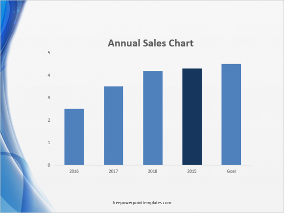
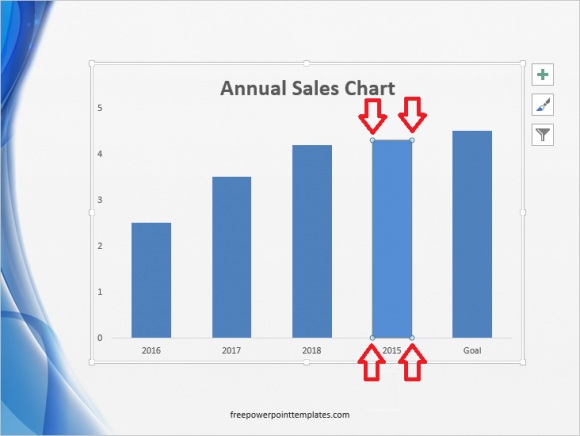
Double-Click the graph to select it. Click the column to select only that column. You will see tiny circles on the edges of the column when it is selected.
(Click here to download the template used in these examples)
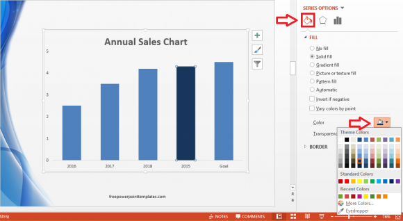
In PowerPoint 2013, Double-click the column to see more options appear on the right. Click the Paint Bucket icon and select the fill color from the options.
The great thing about this trick is that you can use it on pretty much any graph in PowerPoint that uses shapes.
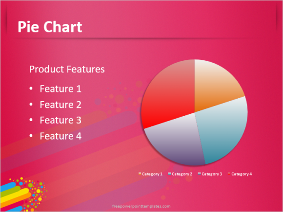
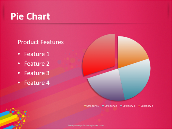
Separate a Slice of a Pie Chart to Make it Stand Out
Many people don’t know this simple trick. Today, I will show it to you. Take any normal looking pie chart, like this one right here:
Now, Double-Click the graph. Click a portion of the graph to highlight just that portion/wedge/slice. Now click and drag the it and you will see it separate from the rest of the graph.
(Click here to download the template used in these examples)
It looks a lot more noticeable and distinct now. This is a great way to highlight a specific portion of a pie graph.
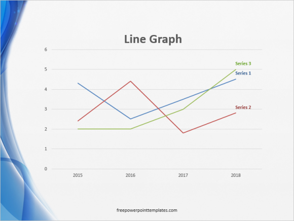
Make Lines Thicker in a Line Graph
Line graphs are really useful. But sometimes the line is too thin to be easily noticeable on a projector screen. You can fix this by making the line thicker and more noticeable. Take this graph for instance:
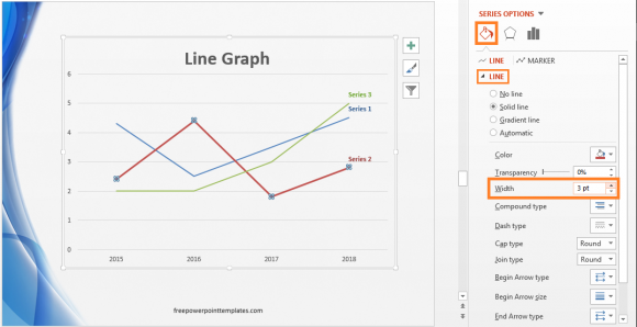
You can increase the width of the lines by Double-Clicking the graph, and then clicking one of the lines to select it. Now, click the bucket icon and change the Width of that line as shown in the image below
Graph hacks like this can make your presentation a lot more interesting for a small amount of effort on your part. Good Luck !!
Leave a Reply