
Many presenters get into the habit of copying and pasting important numbers from spreadsheets to PowerPoint. They intend to direct attention to important financial figures, but it is not a good approach. This is because the people that you’re presenting to aren’t as familiar with the numbers as you are. It is not easy for them to figure out the message that you’re trying to convey by using those figures. Here we will talk about better ways to present such information visually.
But I Put Important Figures in the Slide
Just copying important figures into the PowerPoint slide is not enough. Surveys such as the The State of Financial Presentations 2014 show that 66.7% of the people who completed the survey think there are too many numbers on the slides. People also complained about the font being too small and slides having too much information for the amount of time. People who completed the survey think that there should be more visuals in the presentation.
How to Show Performance Figures in a Presentation?
Performance is measured by comparing current values to past performance or projected values. You may also be comparing to a standard that you’re trying to achieve. Different types of graphs are useful for comparing different types of performance figures.
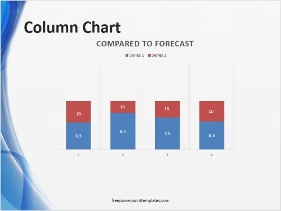
For example, people may want to see projected performance compared to actual performance. In this case, you could show them a graph with the expected and actual figures on it.
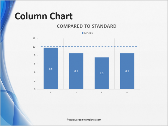
If you’re asked for the performance figures compared to a standard, then you can make a graph with values and the standard represented by a dotted line. By looking at the chart, it is easy to tell how far or near the performance came to the ideal or the standard.
(You can download this PowerPoint template by clicking here)
This way, then audience doesn’t need to scan between two sets of data on a table. It makes look at data a lot more intuitive.
With more data being compared and analysed than ever before, presenters need to be better able to represent this data visually. This helps accomplish the primary goal of the presentation, which is to communicate the figures to the audience who wants to know them.
Image Courtesy:
A truncated bar graph. by Smallman12q [CC0 1.0] via Wikimedia Commons
Leave a Reply