
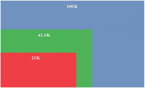
Shape comparison diagrams are becoming more and more common in print media. This diagram helps the viewer visualize data just like a donut or pie chart does. These diagrams are very similar to treemap charts as well. Shape comparison diagrams can be made with different shapes. David McCandless also used this type of diagram in his TED talk on the beauty of data visualization. You can check out his talk by following this link.
Why Use Shape Comparison Diagrams?
Shape comparison diagrams are easy to read and understand. They work well, especially for presentations on a large projector screen. They are easier to read compared to a pie chart or a column graph. Especially in pie charts, smaller portions can get too small to visually compare with other small portions.
How to Use Shape Comparison Diagrams?
Shape comparison diagrams are not available in PowerPoint, so you will need to make your own. There are a few online tools that you can use to make the necessary calculations for you. You can make these diagrams with squares or circles. Click here to read AJ Walther’s blog post on calculating dimensions for the diagram using a free tool that anyone can use to make these diagrams themselves.
But, I Don’t Want to Make Calculations and Draw it Manually
If you don’t want to make calculations and draw the diagram yourself, then you can choose to make a treemap chart instead. A treemap chart is basically a shape comparison diagram, and it available as a built-in feature in PowerPoint 2016. If you happen to be using PowerPoint 2016 or Office 365, then you should be able to make these diagrams painlessly.
This type of diagram works really well for comparing data in sets that contain very big and very small numbers. This can really improve your presentation and help your audience as well.
Leave a Reply