Humans react to color and they are influenced by it. Our thoughts and emotions can be shaped by a change in color. It is a very instinctive drive that all of us have in us. Seeing a bright blue sky invokes relaxation, and a sky filled with dark clouds has an ominous feel to it. Bright golden sunshine can make you want to jump with excitement, and a foggy & cloudy sky can make you feel a bit blue.
Colors in themes are an important part of PowerPoint. Color influences the look and feel of a PowerPoint presentation regardless of its content.
Changing Theme Colors To Match Your PowerPoint Presentation
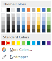
These colors really define a PowerPoint template. All graphics created with that template will have these color in them. Microsoft has paid professionals a lot of money to come up with these color combinations for PowerPoint. But, even they don’t always work with your presentation’s graphics.

There are almost 16.7 million of these colors in the RGB model. Although around 60% of these colors can be seen apart from each other. You can use this to your advantage by changing color values a little bit to match colors. You can improve and tweak PowerPoint theme colors by changing the tint. Here’s how:
First, insert a square in a slide. Draw it by dragging and holding the Shift key.
Copy the square and join the two squares together. This will help give you a big preview of the changes you are making. This way, even slight changes can be seen easily.

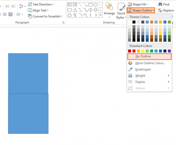
Click Shape Outline > No Outline, do this for both squares. This will remove the distracting outline from your view.

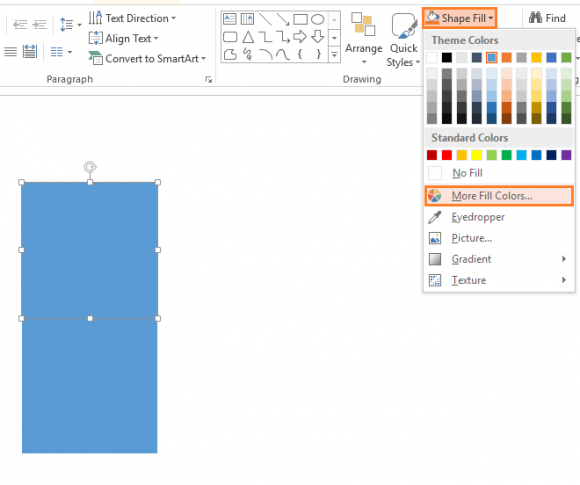
Click Shape Fill > click More Fill Colors…

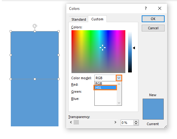
Click the arrow next to Color Model > choose HSL from the list

Now, try changing the values. You can make slight changes to the color by increasing or decreasing its Sat, Hue, and Lum values. You can darken or lighten the theme colors from here to match your theme, backgrounds, and logo. This makes it possible to avoid overly bright and dark colors in the presentation.

Leave a Reply