Have you ever wondered what your presentations would look like if they were printed on white paper with black ink? This is a scenario you might face if your presentation were to be printed and given to the audience as handouts. Visuals in colored slides can often look very different when converted to grayscale.
How Your Slides May Look In Grayscale
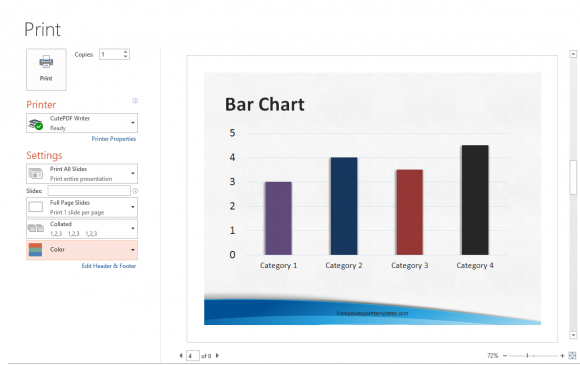
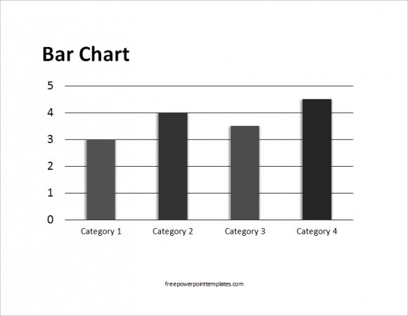
Here you can see an example of how a visual looks like when converted to greyscale in PowerPoint. You can see the print preview of your Presentation’s slides in grayscale by using the keyword key combination Ctrl+P and choosing between Color, Greyscale, and Black & White.

(Click here to download the template used in this example)
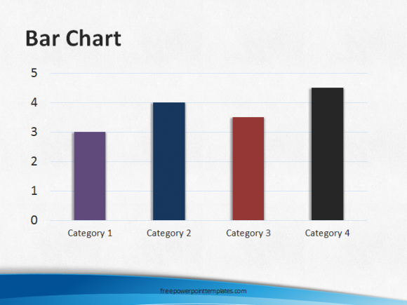
You’ll see that some columns look pretty distinct in color, but very different when you try to print them using black ink.

 There are a few ways to choose correct colors for printing. The following are two very common solutions.
Use Fill Patterns For Visuals
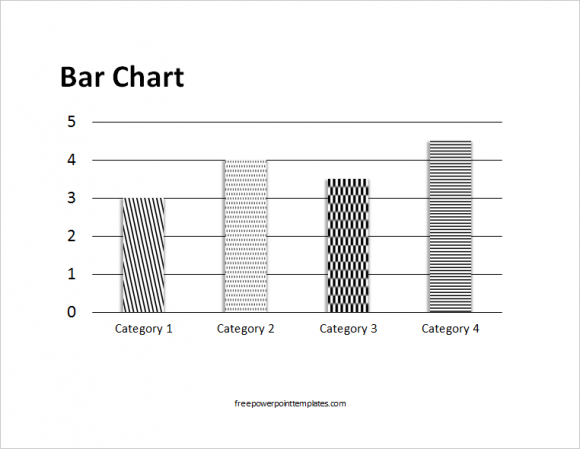
Fill Patterns exist almost exclusively to serve this purpose. You can see some fill patterns in the picture below.

Click here to learn more about using fill patterns in PowerPoint slides. You might not find these fill patterns on some versions of PowerPoint.
Choose Colors With Plenty of Contrast
When converting colors to shades of gray, PowerPoint translates each color to black and white based on contrast. That is why colors having similar contrast levels will look almost the same in black and white. So, choose light and dark colors to represent columns.
Preview All Slides Before Printing
Make sure to preview all slides before you start printing. Use the keyboard key combination Ctrl+P and look at each slide and how it looks in grayscale. Only print when the slides look the way they’re supposed to and are easily readable in black and white or greyscale.

Leave a Reply