Lets face it, most slides have too much text on them. The text is intended to inform and educate. But, too much text can actually hinder the audience from understanding key points in the presentation. So, how do we use the positive effect of using text in presentations to the max? Here are some ways to do just that.
Why Must We Reduce Text in Our Presentations?
We need to reduce text in our presentations because too much text forces people to read and listen at the same time. Thus you’re forcing the brain to multitask, which is not a very good idea.
The Myth of Multitasking
The myth of multitasking is just that, a myth. People can’t do two things at the same time. Instead, they have to constantly switch from one to the other. This causes a delay and makes the brain work harder but to no avail.
It is actually better to just do one thing at a time. For the same reason, we need to reduce text in our presentations. The reason is because people should either be reading or listening, not both. In fact, the text should make them want to listen.
How To Remove Text Without Changing Its Meaning
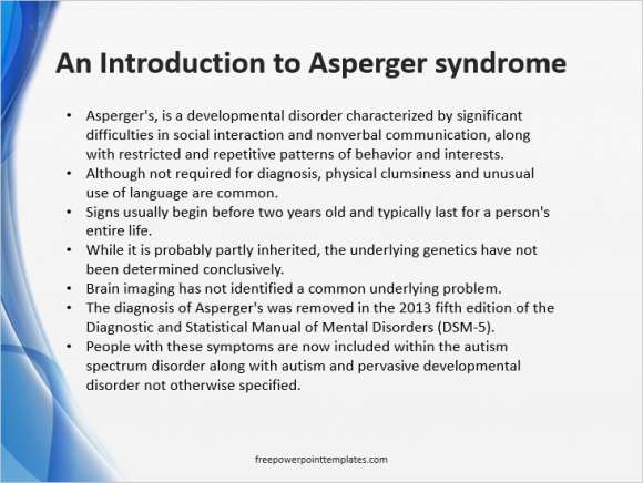
Here we have a really text-heavy bullet-point slide. This slide is a pretty notorious example of using too much text. Sometimes it is required to have a somewhat large amount of text, but what should we do then?

Reduce the text to its most short, basic, and informative form. Like a Heading or a Sub-Heading.
Obvious Information
This is information that people can figure out by themselves. For example, the title of this slide could have just been “Asperger’s Syndrome” instead of the current title.
Repeating Information
Next we observe that there is some redundancy in the text. This includes repetition of the main keyword more than once on the same slide instead of just presenting facts and figures instead.
You’re Essentially Writing Sub Headings
Remember that when you’re writing text for a presentation, you’re going from textbook paragraph to conversation style to presentation style of writing.
Let The Speaker Explain it To Them
All text in a presentation is supplemented with the speaker’s voice, so its not really necessary to include a lot. You just need to include the most essential information.
Just pretend that you’re writing sub-headings. The explanation will come from the speaker’s own voice.
Final Product
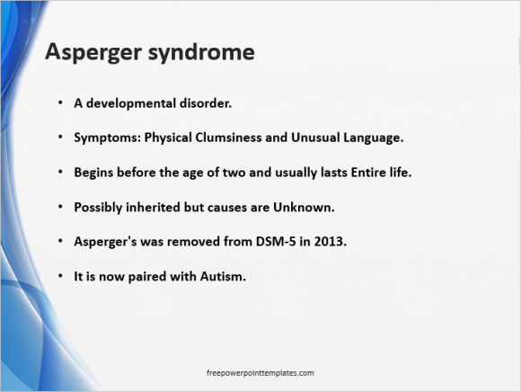
By applying the techniques we discussed above, we were able to reduce the text on this slide to less than half of what we previously had.

We’ve also added some line-spacing and made the text bold. Pruning text should have made this presentation slide a lot more effective.

Leave a Reply