The default layout of PowerPoint presentations in most presentation templates is the same. Text heading with Bullet points on pages where topics need to be discussed. While this works for the most part, bullet points are usually boring and monotonous. Many presenters simply use them because they are not aware of other options available to them.
An Example of Text in Bullets
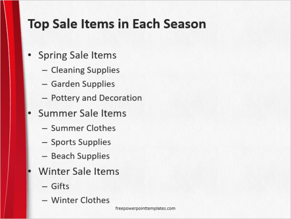
A typical example of text with a bullet point list looks similar to this:

Here you have bullet points and sub bullets. A very common sight. But how can we improve on this with minimum effort. Lets find out!
An Example of Simple Visually Enhanced Bullet Points
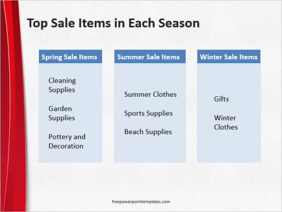
These are the same bullet points in a visually enhanced format:

(Please click here to download the PowerPoint template shown in this example.)
How To Make Visually Enhanced Bullet Points?
Making these custom visuals is surprising easy. Draw a rectangle using the text box tool, in PowerPoint 2013 go to Insert and then click Text Box.
Now, click and drag to make a rectangle text box. Use Shape Fill under HOME to change the color of the box. Change Font color and apply effects as necessary to make it more presentable.
Now, draw a bigger Text Box for the lower half, and change its size to suit your needs. Once you’ve made one of these boxes, copy and paste to make as many as you want.
Download These Visually Enhanced Bullet Points
You can download a slide containing this visual by clicking this button:
Change the size and color to suit your requirement. I’m sure that you can make it even better than the way it looks right now. If you liked this post then make sure to leave a comment and share this post with other people.
Thank you for reading, Have A Nice Day 🙂

Leave a Reply