Charts and graphs are shown to the audience to help them easily understand the data which is being presented. Figuring out lists and tables is really boring. Visuals like charts and graphs are a lot easier to comprehend for everyone. As a presenter, we are not only supposed to use a graph, but to also use a graph correctly. Because using the wrong type of visual can make things confusing.
Here, we will learn when to use a pie chart as well as how to make a simple pie chart in PowerPoint 2013. (The method should be similar on other versions of PowerPoint). Lets go!

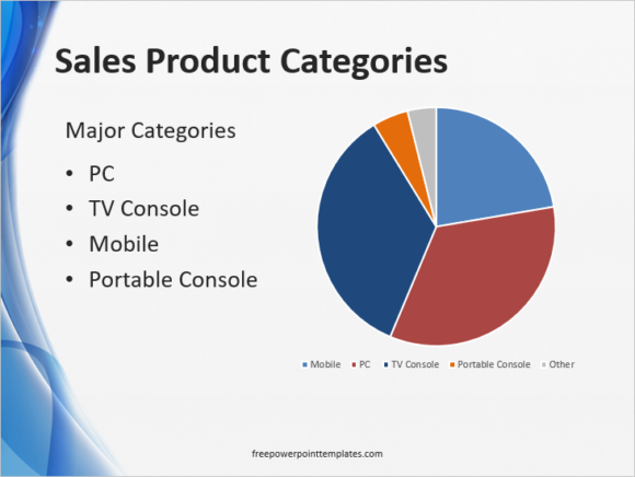
Example of a Pie chart
What is a Pie Chart?
Pie Charts displays data, information, and statistics in the shape of a pie. It is a circular chart which is broken down into sections. Each segment represents one category.
When To Use a Pie Chart?
Pie Charts should be used when comparing parts of a whole. They are used to compare portions of a fixed amount. For example, you can find out the market share of a certain product or service; market reach of a business; time allotted to each task; money spent from a budget, etc.
Pie Charts are Probably The Easiest to Read
Pie charts are one of the easiest charts to read because of how simple they are. This is among the many good reasons why they are one of the most frequently used type of charts.
Tips on Using Pie Charts
Here are some tips when choosing pie charts to represent data:
They only work with One set of data.
Pie charts are not suitable for Negative values.
Pie Charts cannot represent Zero.
The Maximum Recommended Number of Categories is about 7. Any more and they might look too small to distinguish.
Pie charts are also not good for representing Multiple Small Values since they would be too small and thus harder to distinguish. But, if you must use it with multiple values, then make sure that percentages or values are written with the Pie Chart categories.
Pie Chart Resources
Graphs in PowerPoint: Pie charts (How to make Pie Charts)

Leave a Reply