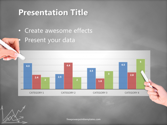
Many presenters need to include numbers in their presentation. These numbers might very well be the heart of the presentation. Presenting them in a suitable way to the audience can often mean the difference between success and failure. Depending on the type of audience, you might want to present these numbers differently. The more casual your audience, the more you can benefit from using visuals and animation. But, even in the case of a very formal audience, you still won’t just be presenting the numbers in a bullet-point list. Here we will talk about how you can match your numbers to the many types of visuals at your disposal.

Why Use Numbers in a Presentation?
Numbers are usually important measurements that the audience needs to know. We usually need to compare these numbers with last year. Comparisons help us get a better picture of trends. Although, text-only comparisons are often difficult to understand. People usually need to know the story behind the numbers to know what is happening. The numbers do not convey a lot of meaning by themselves. This also makes a big difference in the mind of the audience.
But I’m Not a Graphic Designer
Creating plain and simple visuals does not require any graphic design training. Basic shapes, graphs, and charts are already available in PowerPoint. All you really need is a process by which to choose the right ones for your presentation.
Its actually really simple. You need to be very clear about the message you’r trying to convey. You can usually divide the message into one of six categories:
- A relation between numbers.
- A relation of sequence.
- A relation of time.
- A hierarchical relation.
- Relation between people and places, and
- An example of some sort.
Once you have the message categorized, you can easily choose what graph or chart to use for it just by looking at the available graphs.
Click here to download the PowerPoint template you see in the screenshot above. Have a great day 🙂

Leave a Reply