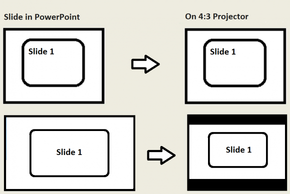
How many times have you seen PowerPoint presentations like these? The slides are widescreen but the projector screen is not. Projecting a 16:9 slide on a 4:3 screen does not look right. Everything gets so small that you can’t even read the tiny font. This is usually the case when the presenter is presenting somewhere new and does not know much about the projector screen they’ll be using.
This mistake can make ruin a well planned presentation as you can see from the following example. You can see that the presentation made in PowerPoint looks normal on the computer, but it is compressed to fit on a 4:3 display. The area above and below the slide is wasted. More than 20 % of the screen is unused and the text is also compressed. This makes the text much harder to read, and makes it too small to be legible.

When you try to display a 4:3 slide on a 16:9 (widescreen) projector, you will see vertical bars on the sides. That can also mean a slight decrease in size as well. It might be a minor annoyance, but its not a big problem. Almost everyone should still be able to read your sides just fine.
What Should I Do To Make Proper Widescreen Slides?
Here are some things you can do to avoid this scenario:
Before you make your presentation, ask if the projection screen and projector are widescreen or 4:3. Most new projector setups should be 16:9 (widescreen) but you should confirm regardless. If you’re not able to get this information, then you can make slides for both ratios. This will ensure that you will be ready no matter the case. But, if you don’t have enough time, then you should make 4:3 slides. Even if the projector screen is widescreen, at least it won’t get too compressed for people to read.

Leave a Reply