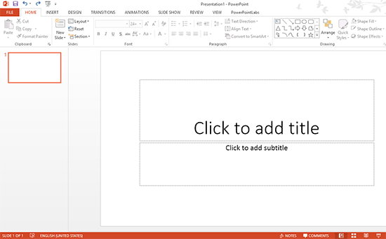
A Blank Presentation. This is what everyone sees when they first discover PowerPoint. It is right there, waiting for new slides filled with pictures, text, tables, charts, etc. Depending on what you know about the capabilities of PowerPoint, you might get overwhelmed or start typing an essay instead of making a Presentation. Its no wonder why many viewers have to bear through long, boring presentations while the presenter is unaware of the lack of effective visual stimuli.
Many people go through this phase when they’re making a PowerPoint presentation. This is where people start to realize that they’re not reaching the audience, and try to understand what should be presented. There isn’t a lot of research available in the specific context of PowerPoint presentations, but cognitive science tells us what the brain will and will not pay attention to. Here we will discusses some of them:
What Does The Brain See In A PowerPoint Presentation?
Instead of recording everything that the eyes see, the brain actually processes a lot less. It throws away most of the original input it received. This is where visual stimuli come in. Some of these visual stimuli are easy to process while others take longer.
Text vs. Images
Text, for example is a necessary tool for a presenter, but takes a lot more effort for the brain to process. Images, of course, are a lot easier for the brain to process. They fit effortlessly with the audience’s cognitive organization. The audience is able to relax and pay attention to the speaker. Images also make it easier to simplify concepts what might be difficult to explain using words alone.
So, How Should Images Be Used?
While images relating to the presentation make great visual stimuli, not all of them are equally useful. Using images that have little or nothing to do with the topic can actually have more negative effects on the audience’s retention. See Tversky and Morrison (2001)
Here are some examples of effective visual stimuli to use in a PowerPoint presentation:
Explaining The Context With Video & Images: If the topic involves locations and people then take a camera with you. Take as many pictures and video as you can, and show your audience what you saw through the camera lens.
Simplify The Topic: If the topic you’re presenting is too difficult for the audience to understand, then use images, video, and animation to help them understand it. This is especially important for technical topics.
Give Examples: When you say to the audience “Let me show you with this example”, it directs their attention to the screen. It gives them the expectation that you are about to present some useful visual information.
Add Detail to the Presentation: If the presentation is about a product, then show a video that shows the audience what it does and how it works instead of explaining it verbally.
Emotional Stimuli: If you’re giving a presentation on the dangers of fast food for example, then you should include pictures showing its harmful effects. Maybe pictures and video of internal organs which were healthy and functional in the past, but currently suffer from the problems caused by the ailment. This can help motivate people to think and understand.
Show Text With Illustrations: Studies show that illustrating text with images has a much higher retention rate compared to normal text. Concepts and details should be illustrated in a PowerPoint presentation.

Leave a Reply