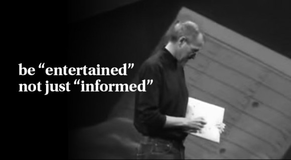
Many people wonder how they can make their PowerPoint presentations look more like the work of Steve Jobs. You might think that you need to use Apple’s presentation software, but that is not exactly true. Power Point presentations can also look pretty amazing. Using a nice, sleek, and simple looking template is a good starting point. But, ultimately all you need is a good story.

Steve Jobs treated each presentation like a little story, complete with its hero, villain, props, and of course the backdrop. Here are some things to consider when making a PowerPoint Presentation the way Steve jobs would have made it.
Say A Thousand Words
Steve Jobs used to make really basic presentations, but they stuck deep in people’s minds because of the way he presented the information visually. Stay away from long lists, unnecessary bullet points, long explanations, and the like.
Keep It Simple
There is a point where the more you add, the less it adds. Depending on the audience that your’re dealing with, and the attention span they’re willing to dedicate to you; you may have a different crowd to work with than you might have imagined.
The Truth is that, simplicity attracts attention, only if it strikes curiosity. If you have their curiosity, then it is at that point that the simpler you make things, the more sophisticated they get. To make it simple is to eliminate the unnecessary, and to keep the message concise.
You Are The Presentation!
What happens when you make a simple, concise, and short PowerPoint presentation? The audience shifts their attention at you. You should have confidence and be able to deliver the message. This will require you to spend some time on presenting and preparing for it. You have to visualize how to deliver the presentation from the perspective of your audience.
Whether you memorize or improvise, the slide should only act as a prompt for you to start presenting the next topic in the presentation.

Leave a Reply