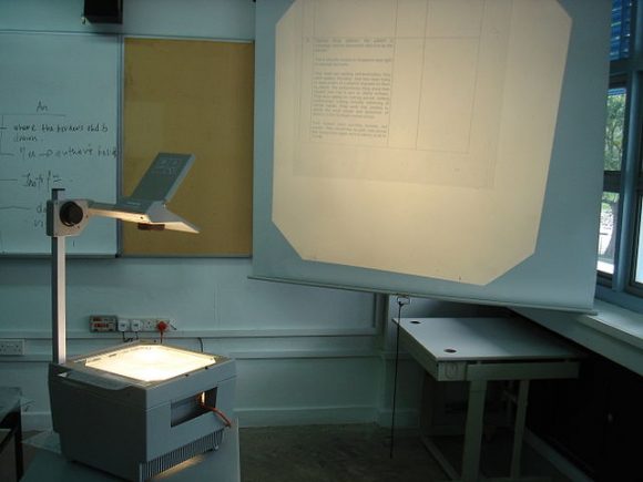
No matter how good your presentation skills or analysis might be, its meaning needs to be clear. If the presentation is not structured in a clear manner, then it won’t make sense to the intended audience. The purpose is lost without clarity.

Avoid Using Slides From Older Presentations
Using older slides makes it more difficult to send a coherent message to the audience. When you use slides from older presentations; go through them and make sure to edit it to fit in the current presentation.
Each Slide Should Have Its Own Topic
Sometimes presenters write the words … Continued on a slide to indicate that this slide continues where the last one left off. Presenters usually do this because they don’t want to write too many topics, but this causes confusion. Instead, you should make sure that each slide has its own topic. Avoid making slides with Continued as a heading. Instead, make sure that there is only one clear point in every slide.
Make Explanatory Headlines For Each Slide
Instead of writing a very short heading, write one that explains the contents of the slide. Your goal should be to include as little text in the actual slide as possible. Summarize the intended message of the slide in its topic heading.
Avoid Using Spreadsheet in Presentations
Many people paste spreadsheets right into a PowerPoint slide. Spreadsheets are intended for calculation, not for communication. Try using a summarized table with large text instead of a spreadsheet. Ideally, you should be using a graph to show the data visually. You don’t need to be a graphic designer to make visuals. Click here for more some tips on how to choose the right graph. This should help you present information with more clarity.
Image: Side Wages [CC BY 2.0] via Flickr
Image: mailer_diablo [CC BY 3.0] via Wikimedia Commons

Leave a Reply