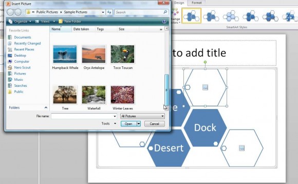
SmartArt is a way to present textual information so that it is visually appealing. There are many layouts to choose from, and all of them can make it easier to communicate an idea to the audience. What we usually see is that people don’t use SmartArt for its communicative utility, but for the reason that it looks cool. This is why some of them can begin to look very confusing.
How People Wind Up Using SmartArt
People usually wind up using SmartArt because it looks really nice. Despite the fact that it might be used in a place where it was never meant to be used. You may see a cool flowchart based SmartArt and use it for listing objects which were in no particular order. To someone who is familiar with the use of flowcharts, this would seem a bit strange. This is because flowcharts show a sequence or steps of a process. A flowchart has functional meaning which is important to understand.

SmartArt Is Too Limited In Its Options
Don’t get me wrong, the charts look great and people like them for that reason. But they are also harder to edit. You can’t really change a lot about them. You have to ask yourself, does this diagram really looks like it was designed to be used the way I’m using it?
If you don’t find what you’re looking for, than you can make your own diagrams using the Drawing Tools in PowerPoint or add to existing charts and diagrams.
But, Are You saying That I Should Not Use The SmartArt?
Look at their descriptions when you’re adding them. Read the description and see if it was designed for that purpose. There’s no specific rule on this and you can use anything that suits you. But to be effective, you’ll need to share something that clearly and correctly conveys your message to the audience.
Image Courtesy:
by Cen Cheng [Creative Commons Attribution licence (reuse allowed)] via YouTube

Leave a Reply