
You may have had to sit through a presentation that was hard to read. Maybe something was written in a bright color on a white background and you couldn’t make it out. Maybe something was in the wrong place and that made it unreadable.
This kind of problem is more common in presentations that are made by people independently. Many organizations have their own guidelines for making presentations, which include colors. Choosing suitable colors can impact the presentation’s effectiveness. What colors should you choose when you’re making a PowerPoint presentation, and how? This is what we will be discussing in this post.
What Impacts Readability More Than Anything? Contrast!
Simply put, contrast is the difference between two colors. What happens all too often, is that people try to make their presentation look good at the cost of poor contrast. Not having enough contrast between the text and background graphics leads to some text being unreadable. Choosing contrasting colors for the background and the text can make your audience’s life a lot easier.
How Do We React To What Color?
It is said that every animate and inanimate object has an aura to it. This aura changes in living things in accordance with their state. So, someone feeling passionate romantic feelings would have a bright red aura, and someone in a relaxed mood would have a blue aura. A gloomy person would have a grayish dark aura, etc. Auras aside, here are some common interpretations of colors and what people generally feel when looking at them.
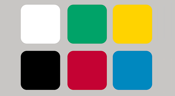
Black (Heavy, mournful, highly technical, formal, death)
Brown (Earth, simplicity, outdoors)
Blue (Peace, tranquility, trust, confidence, security)
Purple (Royalty, wisdom, spirituality, mystery)
Green (Nature, environment, health, reptiles, insects)
Gray (Conservative, practical, reliability, security, staid)
Red (Passion, excitement, love, intensity, heat, aggression)
Orange (Warmth, expansive, flamboyant)
Yellow (Optimism, happiness, idealism, imagination)
White (Purity, reverence, cleanliness, simplicity)
source: link
Some Colors To Stay Clear Of
Some colors should not be used with each other.
Orange & Blue look unpleasant when used together.
Red & Blue may seem like a good option initially, but they are not easy to read on a projector screen.
Red & Green are really hard on the eyes. Please avoid using them together.
Leave a Reply