
The fonts you use in your presentation can make a big difference in how people feel about it. The font should have a contrasting color so that it is easy to read. It should be large enough for people to read. It should also be aesthetically pleasing without being difficult to discern.
Types of Fonts
There are three main types of fonts that make up all other types. These are Serif, Sans Serif, and Script.
Serif Fonts
Serif fonts have decorative lines on the ends. The most popular serif fonts are probably Times New Roman, Bookman, Garamond, etc.
These fonts look great on sharp computer screens but prove a bit difficult to read on larger and less precise projector screens.
Sans Serif Fonts
Sans Serif fonts do not have decorative marks on the ends of their lines. Some common sans serif fonts are Calibri, Arial, Century Gothic, Tahoma, etc.
These fonts are easier to read because they are simpler. Reading an easier font helps people read quickly, and also helps them feel more comfortable with understanding the message.
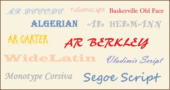
Script
Script fonts try to copy the look and feel of handwritten text. Some script fonts are Edwardian Script, Freestyle Script, Vivaldi, and French Script.
Script fonts may look good on images but they should not be used in presentations because they’re a bit harder to read. Try to avoid these fonts for Titles and Body of text.
Optimal Size of Presentation Fonts
According to Guy Kawasaki, the best size for fonts is 30 points. If you want to adjust the size of your presentations fonts according to visual acuity, then divide the age of the eldest person in the audience by 2. This large font also forces you to use less text on your slides.
Note: Please avoid using third-party fonts that don’t come built-into PowerPoint. These fonts may not appear correctly on the presentation computer if they are not installed.
Leave a Reply