
A graph legend is usually a colored box which indicates the label of an element on the graph. You know, this thing on the right side of the graph here:
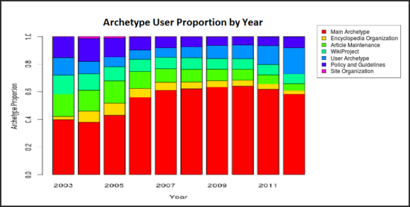
What do you do when a graph legend is so small that its blurry when shown on a larger screen? Sometimes the legend has to be small so that other content can fit inside the screen horizontally.
For example a graph like the one pictured here. If it had more columns and the legend needed to be smaller, that would make it difficult to read the labels on the legend. Not only does the legend need to be larger, but this also takes space away from the graph.
What can we do to help fix this issue? One thing that we can do is to remove the default legend and replace it with a larger one.
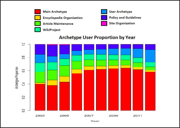
This graph might look like its taking more space elsewhere, but it actually makes the graph a lot easier to read than before. Isn’t that what visuals are really for?
This graph legend can be made using simple drawing tools available in all versions of PowerPoint.
Set The Graph’s Margins to Zero in Addition to a New Graph Legend
One thing you can do to make your graph even better is setting the graphs margins to zero inches. PowerPoint sets the left and right inside text margins to 0.1 inches by default. Margins take up unwanted space in the graph, especially when the graph legend has been removed. You can also opt to remove the border line altogether if it is not needed.
Image: [CC BY 3.0] via Wikimedia Commons
Leave a Reply