
Minimilistic design is all the rage these days. This trend can be see in the new designs for Google’s Android, Microsoft’s Windows, and Apple’s iOS. It is also apparent in the new versions of Microsoft Office. The default column graph in newer versions of Microsoft Office features new minimalistic designs.
Why Not Just Use The Default Chart as It Is?
There are a few good reasons for not using a chart in its default formatting. One reason is that when everyone uses the default chart designs, using a different chart design helps get more attention from the audience. It also makes the chart easier to understand when it does not contain extra details.
Remove All But the Most Necessary Elements of the Chart
We’re looking for elements in the chart that can be removed without impacting any of the information presented in it. This also makes the chart easier on the eyes. Here is an example of a default chart in PowerPoint 2013:
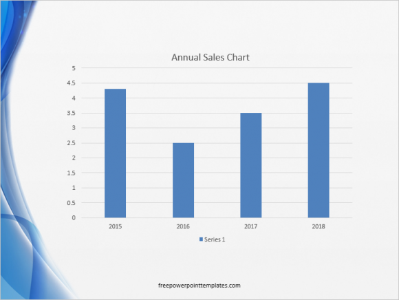
Your chart might look a bit different depending on the PowerPoint template you’re using. Now, we will start removing some elements from this column graph.
Remove Horizontal Lines
Click the column graph and click any of the horizontal lines in the background. You’ll see that they are selected by the circles on their edges.

Press Delete on the keyboard to remove the horizontal lines from the chart.

(Click here to download the template used in these examples)
Fewer Numbers on the Vertical Axis
The default graph in our example has too many numbers on the vertical axis. This makes the column graph look cluttered and messy, especially when that detail is not needed. Here’s how to have fewer numbers instead:
Double-click the text on the vertical axis of the column graph to see additional options.
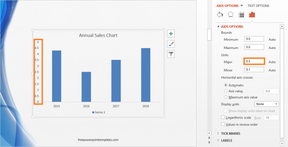
Now, under Axis Options, look under Units. The Major value in this example is 0.5, change it to 1

Fill The Gap By Making The Columns Wider
At this point our column graph looks a little empty. If your graph also has gaps between the columns, then you can make them wider to fill the gap. Double-click one of the columns and make sure that all of the columns have the tiny circles on their corners indicating that they’re selected. You should see additional options on the side.
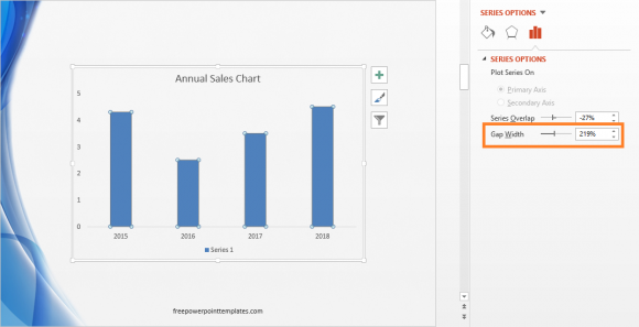
Decrease the Gap Width from its default value to a width you prefer. You will notice that the columns get wider as you decrease the Gap Width.

Apply Some More Details
If you only have one series of data in the column graph, then you can delete the Series label as well. This will make the column graph bigger. Apply formatting such as the bold effect, and increase the size of the title of the graph if it looks too small. Adjust the size of the graph if it looks too small or too big.

Leave a Reply