
Line graphs are a very popular type of graph for showing trends. Trends and patterns are a recurring theme in most presentations. The whole reason for using a line graph is to show data obtained from a table in a way that is easier to comprehend. Line graphs that look a bit overloaded can actually hinder this purpose. Today we will help you make line graphs easier to understand.
Make Lines in the Graph Easier to Read
All too often, lines in the graph are difficult to read simply because they are not prominent enough. This can happen to you if the presentation slides you prepared on a computer screen are shown on a projector. Make sure to use contrasting colors for lines in a graph to make them easier to read.
Changing the width of lines in a graph is quite simple. Double-click any of the lines in the graph to see more options. In PowerPoint 2013, you should see more options on the right side. Click the Paint Bucket icon.
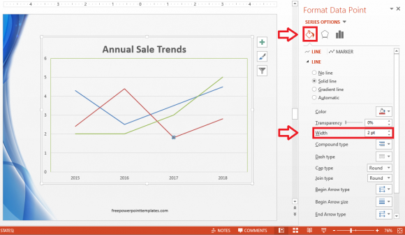
Change the Width to 3pt or 4pt depending on your preference. Repeat this procedure with all the lines one-by-one to change their width. You can make one line wider than the others to discuss that line in particular. You can also change the color of the lines so that they don’t blend in with the background.
Add Better Labels To The Line Graph
When people look at a default line graph, they have to match the color the lines to the legend in order to figure out what each line represents. There’s no need for this if each line has its own color coded label.

(Click here to download the template used in these examples)
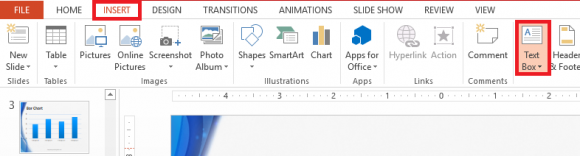
Making these labels is simple. Click Insert from the ribbon toolbar and click Text Box.
Make one text box for each line. You can position them anywhere you want as long as they are easy to find near each line. Make sure to bold them and apply the same color to them as the color of the line they represent. This should make your line graph a lot easier to read and follow.
Leave a Reply