
It is pretty common to see a dual-Axis graph in PowerPoint presentation. These graphs have an x-axis and a y-axis, but they may also contain another x or y-axis. They usually appear as column and line graphs. They are supposed to make a lot of data easier to visually comprehend, but sometimes they lead to more confusion. Today, we will be talking about effective ways to use a dual axis graph.
What is a Dual-Axis Graph?
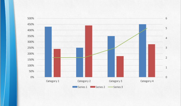
A dual-axis graph illustrates the relationship between two variables. They usually contain line or column graphs, and they can also contain two line graphs or two column graphs. These graphs can have two x or y axis. Many people don’t like these graphs because they can make things confusing.
Common Problems With Dual-Axis Graphs
Dual-Axis graphs are essentially two graphs joined into one. Because of this, the correlation between the data in both graphs can differ widely in most cases. They may not seem like they’re related and thus provide a suitable comparison. If you plot two unrelated data sets on the same graph, it can cause people to think that they are actually linked, when in reality that might not be the case.
When To Use a Dual-Axis Graph?
There are times when using these graphs can be a good thing. They are great to show correlation between two sets of data. If you find a pattern between two graphs, then you can put them together and show people how those two graphs show a trend. Although, you have to be clear that these are two different graphs. When you show it to the audience, show them the first graph, and then show them the other graph; and then finally show them the dual axis graph. Showing the dual-axis graph in steps will help people follow your train of thought more easily.
Leave a Reply