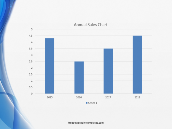
Here we have 3 ways to make column graphs better, but you can take these tips and apply them to other types of graphs as well.
Use More Than One Color in Column Graphs
Using more colors means that you can give more emphasis to some contrasting information. This could be a column which is representing goals, standards, projected value, maximum, minimum, etc.

What to Remove and Keep in a Default Column Graph
We see that with graphs, less is often more. Keeping the least amount of detail and removing all but the most necessary elements of the column graph will make it simpler. It is also easier on the eyes since there are less distractions to take your focus away.

This is what a default column graph may look like on your computer. It might look a little different depending on the PowerPoint template you decide to use. Column graphs are getting more and more minimalistic in recent versions of PowerPoint. Still, you can remove horizontal lines in the background, tick marks on the horizontal and vertical axis, remove extra text, and have fewer numbers on the axis to make it easier to read. You can also make the columns a bit wider if you have a few columns. For example:

(Click here to download the template used in these examples)
You can see how much better the graph looks just by removing a few things and making the bars more obvious. You can get detailed instructions on how to do this in these instructions.
Use Better Labels For Graphs
The way you use text on your PowerPoint presentations can really make a difference for the audience. You may find some of these effects as presets, but you can also make them yourself. Some examples include writing text on top of columns in a graph, using the bold effect (and a different color) for the column you want to highlight.

Click here to learn how to apply these effects to highlight a column in a column graph.

Leave a Reply