
Column graphs are one of the most common type of graphs in PowerPoint and presentation software in general. They are used to show the relation between numbers in a table. Their simple appearance makes it easier to comprehend the data without having to read a table. Simpler and more thought-out graphs are gaining popularity among presenters and audiences alike. In today’s article, we will take you through the steps to highlight columns and get the audience to focus on certain information.

This is the graph that we will be using in this example. If you like it, then click here to learn how to change a default column graph into this formatting style.
Why Highlight Columns in a Column Graph?
There are times when one piece of information is in contrast with the rest. This could also be a number that is too small or too big in contrast to the other numbers in the table. Highlighting columns is especially important when they won’t stand out on their own. Here are some ways that you can highlight columns in a graph.
Change the Color of the Column You Want to Highlight
Changing the color of one column makes it stand-out from the rest.

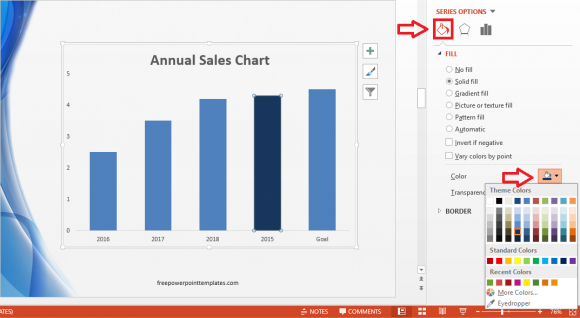
Changing a column’s color is easy. First, click the column, and make sure that it is the only one that is selected. Small circles will appear on the edges of the column when it is selected.

(Click here to download the template used in these examples)
Double-click the column to see more options. In PowerPoint 2013, you should see more formatting options on the right side. Click the Paint Bucket icon and then click the smaller paint bucket under Fill to select a color for the column.
Click here to learn how to change colors in a column graph.
Use Text Formatting to Make Columns Stand Out
Additional text formatting can be applied to highlight columns even further. In the example below, we have used text boxes to add numbers on top of each column to indicate their value. We have also added a bold category label (2015) of the highlighted column. Here’s how:
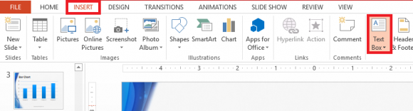
Click Insert from the Ribbon toolbar, and then click Text Box.
Draw text boxes for all of them to make it easier to read their value. Here, we have applied the bold effect to the value of one column.

Now, to add the bold effect to the category label (2015). This is a bit tricky, but simple. Take a screenshot of the slide by using the PrtSrc or PrintScreen key. Open paint and paste the picture using Ctrl+V
In Paint, make a new Text Box and type a bold version of the label that is a bit bigger. Highlight and copy the text you wrote using the Select tool in Paint.
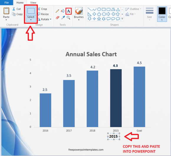
Now, paste this label in the PowerPoint slide. Cover the old label with the new one from Paint.

Leave a Reply