
Colors convey meaning. This is true for graphs and charts in any presentation. Using default designs and colors for graphs is enough for many people but, meaningful use of color can take your presentation a step further. You can use color contrast to your advantage by color coding some portions of a chart to help focus the audience’s attention to that specific portion. Today we will talk about how you can use colors in a column graph to more effectively convey meaning in a PowerPoint presentation. You can apply this to other types of graphs as well.
How To Apply A Color To A Column Graph
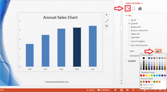
Applying color to a certain column of a column graph is pretty easy. Click one of the columns to select it. You will see that circles appear on the edges of a column when it is selected.

Double-click this column and you should see more options. These options appear on the right hand side if you’re using PowerPoint 2013. Click the Paint Bucket icon to see Fill options, and select a fill color.
Limitations Of Using Color To Convey Meaning
One important limitation that you should know about using color in PowerPoint presentations is that many people won’t be able to see them correctly. Color blindness or color vision deficiency effects 1 out of 12 men, and 1 out of 200 women in the world according to ColourBlindAwareness.org
How To Make Graphs Accessible to the Most Amount of People
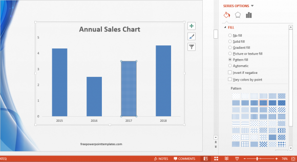
Always try to use contrasting colors when trying to use different colors in your presentations. Use colors and patterns together. To do this, double-click a column to see more options. In PowerPoint 2013, you should see more options on the right side of the screen. Click the Paint Bucket icon. Under FILL, click Pattern fill.
There are not only many patterns in the list, but you can also choose a background and foreground color for the pattern of your choice.
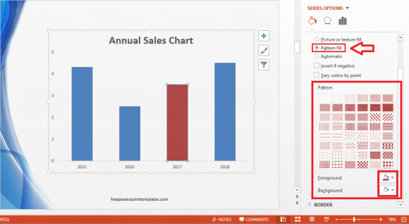
This not only helps people with vision imparity, but also makes the chart black-and-white printer friendly.
Leave a Reply