
The use of Donut charts seems to be a rising trend. Simple donut charts look a lot like pie charts. A donut chart is used to show parts of a whole, so you might even think that it is just a pie chart with the center cut out. Even though donut charts are pretty similar to pie charts, they actually have more features. They are able to plot more than one data set and they give the presentation a fresh look. Today, we will be talking about how to make a donut chart in PowerPoint.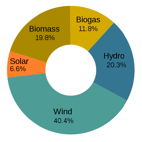
They look almost identical to pie charts, but they have more features. Despite their appearance, they are actually really easy to make in PowerPoint. This is because they are built-into PowerPoint itself.
Why Use Donut Charts?
There are many advantages to using donut charts. They can be used to show things like market share, poll results, budget spending, or any other parts of a whole. You can also use them as a substitute when there are many pie charts in a presentation.
Tips on Making Donut Charts
Donut charts look great with a few portions, but more than three or four wedges can start to get difficult to understand. These charts are also harder to label. You can either make the labels and drag them on the chart, or move the labels outside the chart.
Donut graphs are usually easier to understand when they have a smaller hole in the middle than the default size. By default, the hole is about 50% of the whole donut, but they are easier to read when the hole is about 30% of the whole. The wedges get bigger and the graph is easier to read.
Donut charts are a great substitute for pie charts. Next time you make a PowerPoint presentation, why not choose a donut chart to give your presentation a fresh look.
Image Courtesy:
English: Electricity generation from renewable sources in Germany, in 2009. by Elekhh [CC BY 3.0] via Wikimedia Commons
Leave a Reply