
Line graphs are a common type of graph because they are used to show trends. Well, we know that people love to see trends, and making better line graphs can make your presentation even more convincing. Today, we’ll be sharing some tips on how you can make your line graphs stand out.
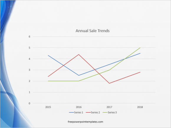
This is a default line graph in PowerPoint. The default graph you make in your presentation might look a bit different depending on the PowerPoint template you’re using.
Draw Longer Lines in the Line Graph
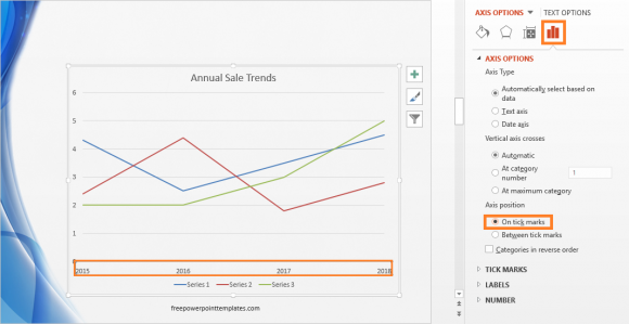
You can make lines of the default graph longer by changing the points where they start and end. This can be achieved by changing the Position axis in PowerPoint 2010 (& earlier versions), and the Axis Position setting in PowerPoint 2016.
Double-click the label on the horizontal axis. Click the Axis options button, and click the On tick marks radio button under Axis position. This moves categories to the bottom, leaving more space for the lines.
Remove as Much Detail as Possible
Minimalistic design is a part of modern charts for the reason that it makes things easier for the audience. By removing extra components from the chart, you’re making it easier to read. This focuses your audience’s attention to right where you need it. Most default line graphs include things like background lines and labels that you can remove it you need to. This makes the chart look better, but be careful to only remove things that your particular audience doesn’t really need to see.
Use Alternate Labeling for the Line Chart
You can remove the default labels and instead use your own labels to make things look more clean and attractive. The default line chart looks a bit too normal. Depending on your presentation, that might be just what you need. But, if you’re looking to attract people to your presentation, then you can remove the default labels and use your own custom labels instead.
For example, you can take a default line chart like this and make it easier to find information.
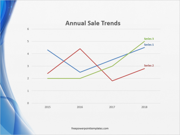
Here is a graph again where we’ve removed the category labels and wrote them in a text box near each line instead. We also increased the width of the lines, and made the title of the graph bigger.
(Click here to download the template used in these examples)
Leave a Reply