
A bar graph or column graph is a visual representation of data in a table. It is one of the most popular types of graphs used in PowerPoint. A bar graph represents data from the table as rectangular bars. The length of each bar represent that value in the table. These bars can be vertical or horizontal. This graph is used so widely because it is great for making comparisons between different values. It can be used to show the difference between very large and very small values. Here we will look at how to make data labels for column graphs.
Starting From a Default Graph
We will start from a default graph. This graph may look a bit different depending on what template you’re using. You can download the PowerPoint template we’re using here by clicking here.
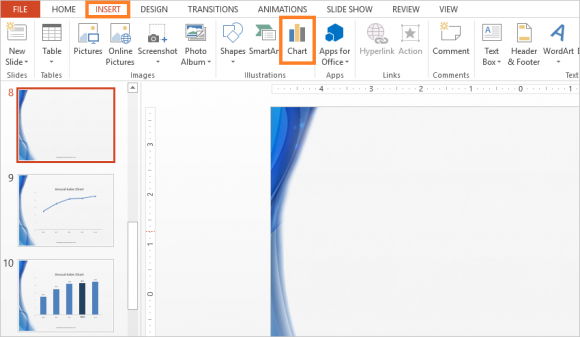
We’re trying to make a simple column graph with data labels on it. We will start by Inserting a column graph in PowerPoint. You can do this by clicking Insert from the Ribbon Toolbar and clicking Chart as shown in the the figure below.
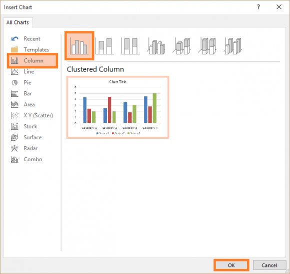
Select a Simple Column Graph and click OK.
Entering Data Into The Simple Graph
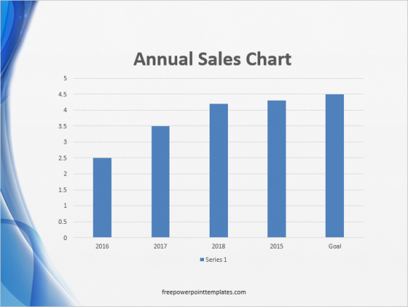
You will be asked to enter data for the graph. Change the blue highlighted area to select what data to include in the graph.
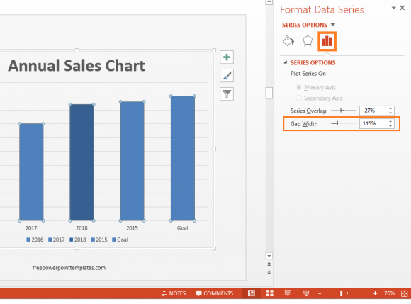
Now, we want to make the columns wider. Double-click the columns to see more options. Click the “Icon with bars on it” on the right side of the screen and change Gap Width as shown in the figure below:
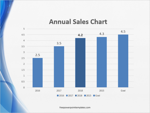
You can also change the color of one of the columns to make it stand out
Adding Data Labels To Column Graph
Adding data labels is simple. It can be done by making text boxes and typing numbers in them. Then, these text boxes can be placed on top of Column Bars . Although, you can also add them by using the feature built-into PowerPoint. Simply right-click any column to select all of them, and click Add Data Labels.

Formatting Data Labels
Click one of the labels to select all of them. Now, you can start formatting them. Increase the font size of teh labels as necessary. If you want to highlight a specific column, then click that specific column’s data label and either make it bold or make it a bit larger to make that column more prominent.

(Click here to download the template used in these examples)
Leave a Reply