
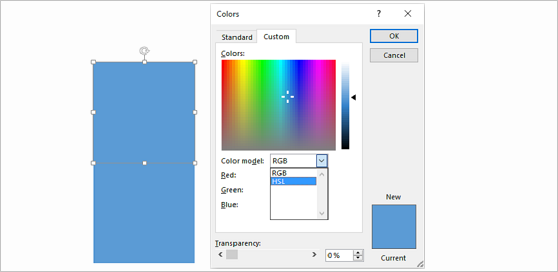
There is no doubt that choosing the right colors is crucial for making a good presentation. Many presenters make presentations that are easy to read on a computer screen. However, they can become almost impossible to read when displayed on a projector screen. Choosing the correct color is probably one of the most important decisions that you will make when making a PowerPoint presentation.
This is especially true if you’re not using a default template to make the presentation. You can find great templates on websites like FPPT. But, if you want to make a custom template or make your presentation from scratch, then please continue reading this short guide.
Contrast With The Background
Contrast is the difference between colors. Low contrast means similar colors; resulting in text that is hard to read. Having high contrast means one of two things. That is, a light background with dark text, or a dark background and light colored text. This would imply that the best colors to choose are black and white. However, we can use more than just two colors in our presentations. These colors have emotional significance and should be used accordingly.
Color and Emotion
We use colors in our presentations because colors evoke different emotions in us. If a presentation is made to influence the audience, then a fundamental understanding of color is vital. Click here to read more about the physiological properties of color. Here are some colors and their emotional attributes from the positive to the negative as they relate to presentations:
Red: Strength, energy, survival, stimulation, excitement, visual impact.
Blue: Intelligence, communication, efficiency, trust, logic, calm, lack of emotion, coldness.
Yellow: Optimism, emotional strength, friendliness, creativity, fear, emotional fragility.
Green: Harmony, Universal love, restoration, environmental awareness, peace, stagnation.
Violet: Spiritual awareness, luxury, quality, authenticity, truth, introversion, decadence.
Orange: Warmth, security, passion, fun, frivolity, immaturity.
Pink: Nurture, femininity, inhibition.
Grey: Psychological neutrality, dampness, depression, lack of energy.
Black: Sophistication, glamour, security, efficiency, menace, heaviness.
![]() Positive: Hygiene, sterility, clarity, purity, cleanness, simplicity, sophistication, efficiency, coldness, barriers, unfriendliness.
Positive: Hygiene, sterility, clarity, purity, cleanness, simplicity, sophistication, efficiency, coldness, barriers, unfriendliness.
Brown: Seriousness, warmth, earthiness, reliability, heaviness, lack of sophistication.
Color Combinations
Some color combinations to avoid are Red-Green, Red-Blue, and Orange-Blue. Favorable color combinations contain high contrast. White or yellow colored text on a dark background works best for reading. Even if you choose a dark background, it will have some areas where the design is light in some places. There may be light areas on the background where it is difficult to read. Make sure to look at the text and adjust its position as needed.
Leave a Reply