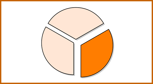
The thing that presentation goers complain about the most is information overload. This problem usually occurs when you try to present too much needless information. Irrelevant data should be removed from the presentation as much as possible. In most presentations it can be reduced to almost 30% of the whole. Saying that the data should be reduced to a third might seem strange to most people, but it is certainly possible and not that difficult to achieve.

Why are People Getting Overloaded with Information?
This usually happens when numerical data analysis is taken from Excel sheets and pasted directly to a PowerPoint slide. Detailed analysis might be important to some people, but chances are that most of your audience is only interested in the bottom line. Excel might be the best tool for numerical analyses, but it is not a presentation tool. When you take your content out of Excel, you have to make sure that it is tailored to fit a presentation.
What Data Do People Really Need to See?
When you’re drawing a comparison using numbers, or when you’re showing measured values, people really just want to see the results. Did we do well enough? Did we not do so great? What does this mean for us?
Numbers that are usually presented are all the data on current sales, past sales, standard figures, and the actual performance compared to the standard. Out of all of these numbers, the most important is performance compared to the standard. When you only display the results, you can easily take out most of the numbers on a presentation. Most people don’t get much from these numbers. All this extra data ends-up distracting them from the main focus of the presentation.
So, the next time you’re copying data from your excel sheet into a presentation slide. Consider prioritizing the results to get laser beam focus from your audience.
Image Courtesy:
A pie chart with one third in highlighted. by Iago One [CC BY 4.0] via Wikimedia Commons

Leave a Reply