
If you’ve ever read what presentation experts think about graphs that don’t start from zero, you will find that they usually oppose it. I do agree that such graphs can be confusing at first glance. However, they’re still useful in some cases.
What Graph Values Does PowerPoint Display?
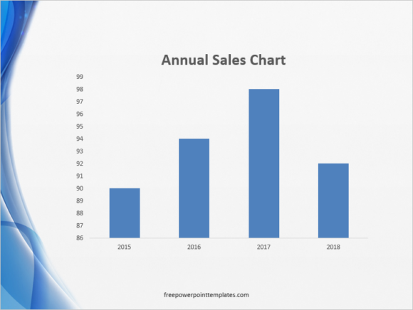
By default, PowerPoint and Excel use the smallest and the largest value for measurement of the axis on the graph. Both of these programs look through the values provided in the data and decide to use low and high values automatically.
Why Is This Approach Un Effective?
Since the graph starts from a value other than zero, it becomes difficult to see the difference in the data. The difference in values is hard to distinguish, leading to misinterpretation. The height of the columns can be quite misleading in this case..
Professionals Advise to Always Start From Zero
Experts of data visualization will commonly tell you to always start from zero. This helps your audience compare the values more accurately. Starting from zero might give you a more accurate graph. However, in cases where the difference in values are very small, this could actually hurt your purpose of conveying the message.
Zoom Up on The Graph
Even though conventional advice says to always start the graph from zero, you can highlight the distinctness of the columns by starting the graph from the point where they start changing.
Start By Showing The Whole Graph First
It is advisable to show the hole graph beforehand, to avoid any confusion. Once everyone knows the base values and how they look in the big picture, you can then show the values from the point where they start changing.
This isn’t enough though. You should also state clearly that the values are not starting from zero, but that instead they are being displayed in a certain range.
Leave a Reply