
Numbers and Financial jargon is ranked as the highest among things people don’t like seeing in a presentation. This is self evident when looking at results from surveys filled by presentation audiences.
This problem stems from that fact that many financial Presenters like to simply copy and paste data from their carefully crafted spreadsheets. But, spreadsheets and presentations don’t mix very well. They’re almost like Water and Oil.
Luckily, there are some convenient ways to take this data and convert it into visuals that are easier to understand.
Copying Spreadsheets in PowerPoint

It is normal for many financial presenters to simply copy tables from spreadsheets directly into PowerPoint slides. Usually in presentations like this, the real message drowns in a sea of data.
Your data might be carefully put together. However, most people probably won’t understand it in such a short span of time unless you explain it to them in the language of visuals.
A Clearer Message Resulting From Little Added Effort
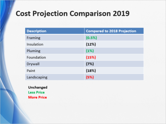
Instead, presenting data like this helps make it clear for everyone. They don’t need to know anything about accounting to read this. And, they’re only seeing information that they came to see.
How To Convert Confusing Financial Jargon into Meaningful Visuals
You may be surprised to hear how simple this is.
First, you select your data. Choose the least amount of numbers you can. Use only the numbers that the audience really cares about.
Second, choose a way to present those numbers that makes it easier for everyone to understand. Think how you would explain the same thing in conversation.
Third, use colors to indicate favorable and un-favorable figures depending on the context. Of course, if those numbers are favorable to the audience then use green. If not, then use red.
Fourth (optional), you can choose to have callouts explain anything which stands out or needs to be explained.
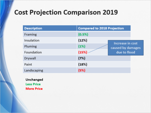
Just using a simple table like this to present financial data in a visually friendly form can work wonders. Converting financial jargon into human speech will also make your audiences happy, especially when they understand more of your presentation.
Hope you found this article helpful. If you liked it then please leave a comment below. Thanks you for Reading and Have A Wonderful Day 🙂
Leave a Reply