
Charts help us communicate results of data and analysis by using visualization. This helps the audience understand the data with ease. In PowerPoint 2016, you now have the option to use fifteen different chart types to represent data. Here we will look at 5 new chart types, and describe what type of data is suitable for them.
How To Use The New Charts In PowerPoint 2016
Open PowerPoint 2016 and click the slide where you want to add the chart.
Click Insert in the ribbon > click Chart to see all available chart types.
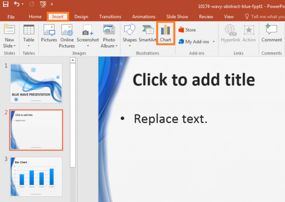
Now you should be able to see the 5 new chart types available in PowerPoint 2016. Each chart type is suitable for representing a certain type of data. Use the correct chart type to help your audience understand the data with less effort.
Box and Whisker
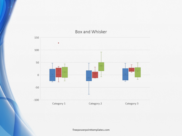
Box and whisker (also box plot) is used to show data as summaries. Smallest (minimum sample), lower quartile (Q1), median (Q2), upper quartile (Q3), and the largest (maximum sample).
Treemap
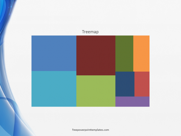
In a Treemap, the data is represented as a tree and each point as a node. A node can have children nodes as well as parent nodes.
Sunburst
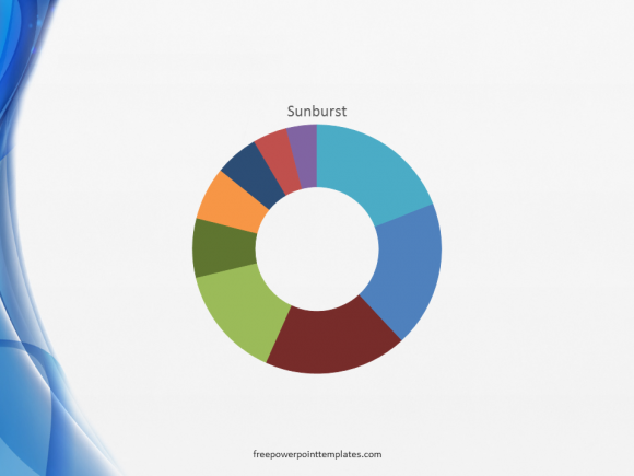
The sunburst chart is used to present relational data sets in compact form. It is a useful chart to summerize data, but it is a bit difficult to read.
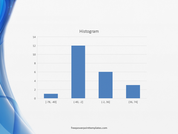
Histogram
(Please click here to download the PowerPoint Template used in this example)
Histograms are different from other types of charts, because they are suitable for showing simple distribution of data on discrete dimensions. You can also choose the Pareto sub-type in the Histogram chart type.
Waterfall
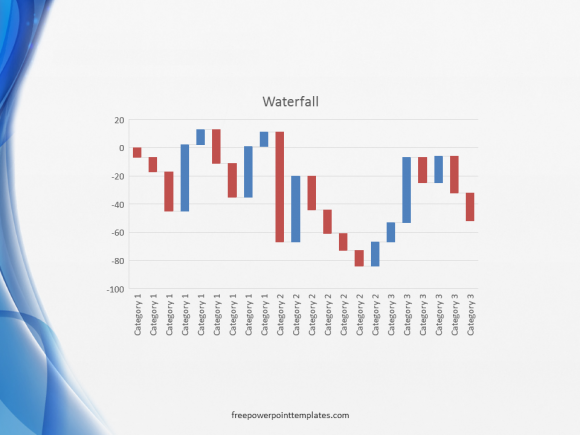
The waterfall chart is used to show positive or negative values in a sequence. It is also sometimes referred to as the flying bricks chart or Mario chart.
If you liked the PowerPoint template you saw in the screenshots above, then please click here to download it. Have a great day 🙂
Leave a Reply