
Whats the point of a presentation that people can’t read? not much. Yet this occurrence is not too uncommon. People end up making presentation slides with portions that are much harder to read than they should be, sometimes not readable at all. Here are some practices that you can follow to make sure your presentation slides don’t end up like that.
Select Contrasting Colors
This is a pretty simple one. Contrast is the difference between one color when compared to another color. Make sure to only use contrasting colors for your presentation slides. You might already be using a template with pre-defined colors. If you choose low contrast colors for whatever reason, they may look great on your computer monitor they they might not look that great on a projector screen.
Use Correct Font Sizes
Using correct font sizes is common sense when designing a presentation. Be sure to use a font tat is supplied with PowerPoint. Avoid using custom fonts for presentations. According to Guy Kawasaki, you should use no less than 30 point fonts for presentations. Click here to learn more about using the correct font with your presentations.
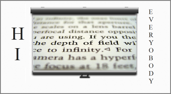
Use Related Images To Avoid Misunderstanding
Use images related to your presentation slides. Don’t use an image just because it looks good. Be especially careful when choosing an image that seems like an example of what you’re talking about. At times like this, use your own images and use callouts to explains parts of the image.
Don’t Place Your Logo Where it Might Be Hard to See
Many people don’t include their logo in the presentation. But if you do, then make sure not to place it on the bottom of the slide. It might get cut off by the projector setup if you do. About 10% of the slide might be cut off on some occasions.
Be Careful When Selecting Background Images
Background images can make text and graphs look less boring. However, be careful when using a background image that matches with the color of the text in your presentation slides.
Leave a Reply