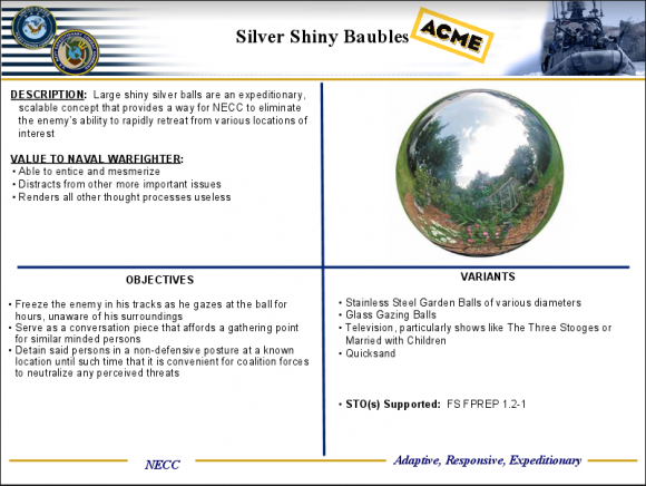
Quad charts are simple charts divided into four quadrants or portions. The chart is actually pretty simple at its core. Here an example of a quad chart:

Merits of a Quad Charts
It is a good chart to use when you have a small amount of time to explain something technical to a relatively non-technical audience. The quad chart should contain all the information you’ll need to present to your audience about the product. It should be all in one page so that it does not confuse the audience.
Why Don’t We See Them Too Often?
The reason why we don”t see these charts too often is because they are normally only used by the military and government agencies. They can hold a lot of information and seem to be great for briefings. It is supposed to be a printed document which is then further discussed in a meeting.
Quad charts can be made easily in PowerPoint. They are not really meant to be a part of a presentation. Rather, they are a document on their own. A quad chart is usually printed in landscape orientation.
Use Quad Charts As Handouts
As much as possible, try to use quad charts only as printed handouts. This is because you might face some problems when using these charts on a projector screen. A quad chart fills a slide with way too much information at once. This can be overwhelming for the audience, and the text might be too little for them to read.
What To Consider When Making Quad Charts?
Make the chart with visuals that are easy to read. Try to put a bit less information in the chart. Use large font, and don’t show the whole chart at once. Build the chart one quadrant at a time. You can do this using simple animation techniques.
Quad Charts are not something you’d want to use too often in your presentations.

Leave a Reply