
One of the most important decisions that business professionals make when preparing a PowerPoint presentation is the selection of graphs. Graphs and visuals really help facilitate people’s understanding of financial data. Making a selection between a line graph and column chart can actually help or hinder people from interpreting the data correctly. Today we will be talking about choosing the correct chart to show trends.
Column Chart or Line Graph?
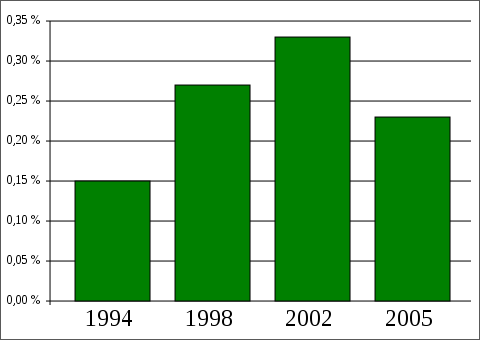
The two most common choices for showing a trend is a column chart or a line graph. Both of these visuals are used to compare values. A column chart is great for showing how one value is greater or smaller than another value. It works really well when there are a few values to compare. But, it is not that good of a choice when the values to be compared exceed 7 or 10 in many cases.
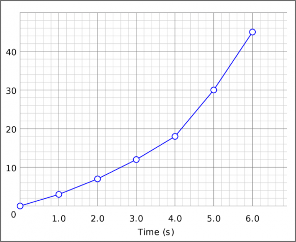
A line graph is great for consistently increasing or decreasing trends. Of course, you can plot any data on it, but it is best suitable for showing an increasing or decreasing trend. Line graphs typically have more data points in them compared to column graphs.
When Not to Use a Column Chart or a Line Graph
There are some situations in which you should use either one or the other. A column chart does not look good when showing an increasing or decreasing trend. People get confused trying to connect the columns in a line, something that you can easily do with a line graph. And, a line graph should not be used to compare data points. People will see the line as more or less a continuous change in data instead of comparing the data points within the line graph.
Many people think that just because they have used a visual, their wok is done. But, people look at different visuals in different ways. Be sure to use the one that shows trends in the best way possible.
Image Courtesy:
Dbenzhuser [GNU Free Documentation License] via Wikimedia Commons
Urocyon [Public Domain] via Wikimedia Commons
Leave a Reply