
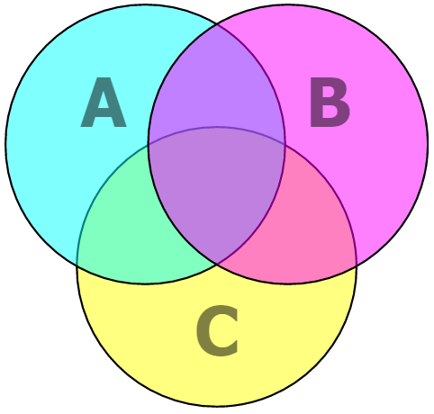
Venn Diagrams can be seen as a type of graph. They are used to represent relationships between two or more sets of data by making overlapping shapes. This easily and effectively shows how some data only exists in one shape and some data exists in both of them. Here we will talk about how and why you should use venn diagrams in your presentations.
When Showing a Relation Between Two Overlapping Sets of Data
This can be a relationship between two or more features of a product. You will be able to show how some features of the product have something in common yet different at the same time. Something like this is difficult to explain with words, but really easy to show in a venn diagram.
When Showing Trade offs of Choosing a Certain Solution Over Another
Everything has a trade off, you can’t have your cake and eat it too. Similarly, when you increase the strength of something, you’ll be giving up speed or vice versa. In terms of manufacturing a product, two circles might be showing time and effort while the other shows profit.
Ways of Making Venn Diagrams in PowerPoint 2013
You can find an option to make Venn diagrams in PowerPoint 2013 under SmartArt. But, if you’re like me, then you’ll want to make your own Venn diagrams out of different shapes. Making your own diagrams will give you more freedom on how big you want any shape to be and where you want to draw it in the Venn diagram. This also gives you the freedom of animating each shape separately.
Tips on Making Custom Venn Diagrams
Since you’re making your own diagrams, you’ll have the option of making them look the way you want as well. For example, you can make them more or less transparent depending on the color of the background on your slide. You can choose to make them look like layers, and make some shapes pop. Use a unique text layout that is not possible with the basic Venn diagram.
As you can imagine, this opens up a lot of new possibilities. So, try your hand and make something unique that stands out in the crowd. Have Fun 🙂
Image Courtesy:
Venn diagram by Verycurve [GNU Free Documentation License] via Creative Commons
By Cmglee [CC BY 3.0] via Creative Commons
Leave a Reply