
Like many many graphs, bar graphs and column graphs use labels. These labels are usually fine, but sometimes you might want to make them look a bit different. Once reason for doing that is making the graph look more unique and catch people’s attention. But, there are functional benefits for using different labels as well. Today we will talk about a few different ways you can show labels for graphs.
When To Use Data Labels?
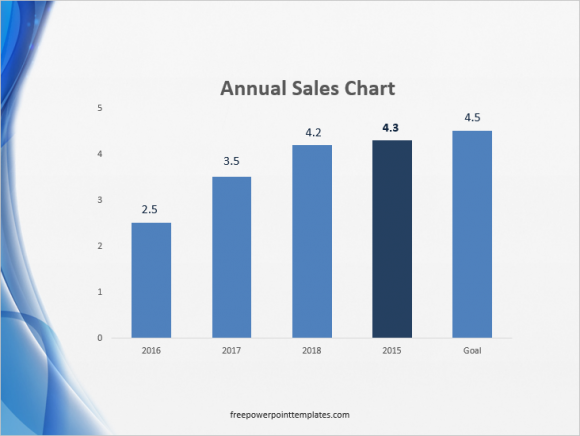
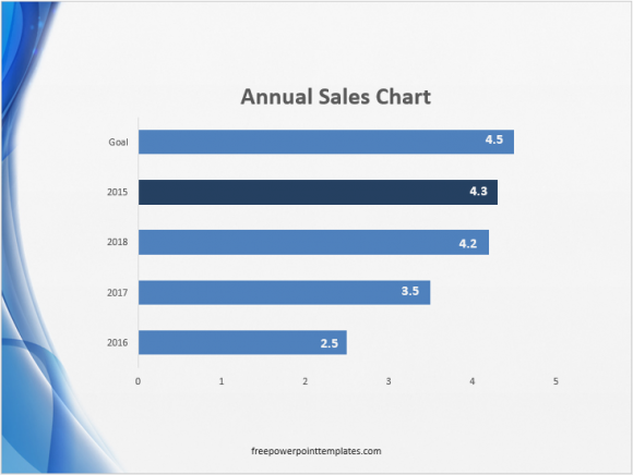
You should use data labels when the audience needs to know exact values for the data points in the graph. Putting data labels on a graph makes it much easier to read it. The trick is to make them blend into the whole thing. They should not look like they were added later. In case of column bars, place data labels inside the column or where the column ends.
(Click here to download the template used in these examples)
In case of a line graph, make the labels near the end of the line. It is better not to use data labels when the trend is more important then the individual values. Otherwise, the labels will distract from the main purpose of the graph.
How To Make Data Labels In PowerPoint?
Making data labels in PowerPoint is actually pretty easy. The tools for making these labels are available in all versions of PowerPoint.
In PowerPoint 2013, click Insert from the Ribbon toolbar, and then click Text Box.
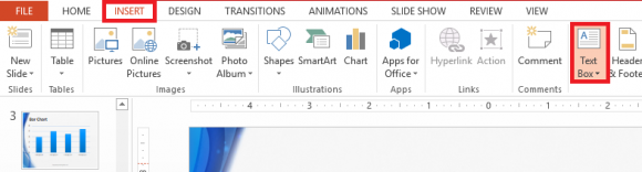
Draw text boxes for all columns of the graph and place them on top of each column.
(Click here to download the template used in these examples)
You can do the same for line graphs. You can also use different colors for different lines in a line graph to make them look different than each other. Change the color of the data label to match the color assigned to the line.
Leave a Reply