
Many people use data from Excel sheets while following the same old methods. Usually this results in presentations that are fine. Other times, they end-up missing out on useful features. There are many useful tips that most people don’t know concerning the use an of Excel chart in PowerPoint presentations. Here, we look at some of these tips about charts and graphs specifically.
Linking an Excel Chart in PowerPoint
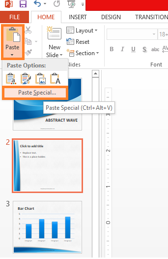
Excel charts should be linked in PowerPoint if you think that the data will be changed in the future. Linking makes sure that anything changed in the excel sheet also changes in the PowerPoint slide. Linking is different from just pasting a table from Excel to PowerPoint. First, make sure that the formatting of the data in Excel is what you want to see in PowerPoint. Now, highlight and copy the table. Paste it into the PowerPoint slide by clicking the down arrow on the Paste button. Now, click Paste Special and select suitable options. You have just linked an Excel chart in PowerPoint. This chart can only be edited from Excel when it is linked.
Make a New Excel Chart or Graph in PowerPoint
Adding a graph in PowerPoint is easy. Just click Insert in PowerPoint 2013, and click Chart. The way charts work in PowerPoint is that they are actually driven from Microsoft Excel. So, once you click Chart, you’ll notice that PowerPoint gives you an excel sheet and some sample data for the graph. Now, copy your data from your Excel sheet and paste it there. Make sure to adjust the highlighted line to select data that needs to be graphed. This type of graph will not be updated automatically when the data changes in the Excel file. You can edit this data from within PowerPoint. If you want the numbers to update automatically, then follow the other method about linking an Excel chart in PowerPoint.
Leave a Reply