
It is important that people understand numbers from financial reports in PowerPoint presentations. All too often we see that numbers from various accounting reports are not easy to understand. Many non-accountants don’t know what it means when a number is surrounded by round brackets for example. These numbers lack certain visual indicators that help interpret their meaning.
People Want to Know Two Things When it Comes to Numbers and Reports
These two things are: Is this number negative or positive? and Is it a good thing or a bad thing?
Confusion arises because when people make a financial presentation, they often take data form their Excel sheet and paste it directly into the the PowerPoint presentation. Accounting notations make sense to the accountant but not to other people. For example, a positive number isn’t always a good thing, and a negative number isn’t always a bad thing. So, how do you show that this is the case?
Using Arrows and Colors as Indicators
Making financial figures easy to read is fairly straight forward. Just use colored shapes and arrows to tell the audience about an increasing or decreasing trend.
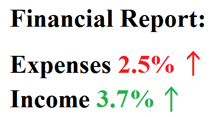
You can make these arrows using the Wingdings font. Click here to see a cheat sheet for the Wingdings font. Many people like to use the triangle symbol to indicate the up arrow, and the upside-down triangle to represent a down arrow. Using these special characters instead of drawing shapes can save you time and hassle. Don’t forget to highlight the text and change its color. Other characters include the two-way horizontal arrow used to indicate that there was no change.
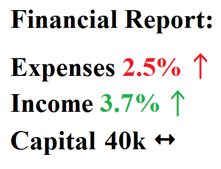
When you’re presenting important numbers to the audience, your job is to make them as easy to understand as possible. Using indicators like arrows and colors should really help you communicate the results clearly.
Leave a Reply