
Presentations are a great tool to impart knowledge and communicate your message to many people at the same time. Not being able to easily read text can annoy people very quickly. Presentations may think that a font size or color looks fine on their computer screen. But what often looks great on your screen might not look the same when shown on a projector screen. Here is some time tested advice on how you should use fonts in your presentation.
What Is The Best Color for Fonts in a Presentation?
Make sure that the font is in contrast with its background. If the color of the font and the color of the background is too similar, then even a large font will be difficult to read. You might want to avoid Red-Green, Orange-Blue, and Red-Blue color combinations. Instead, try using White or Yellow text on a Dark Background.
Learn to optimize your presentation for people with common forms of color blindness here.
What Is The Best Font to Use in a Presentation?
Common are the best fonts for PowerPoint e.g. Arial, Times New Roman, Calibri, etc. They are simple, universally accepted, and they won’t be problematic when you share your presentation with other people using email.
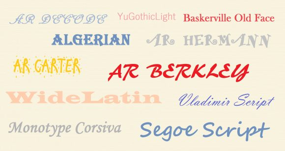
Only use a fancy third-party font when the presentation computer will have that font installed on it, and if you’re willing to make another version of the presentation for emails.
What Is The Best Size for Fonts in a Presentation?
The size of fonts to use in a presentation depends on the visual acuity of the audience. Perfect vision is 20/20. According to Dave Paradi, font size should be 36 to 44 points for titles, and 24 to 32 points for normal text. That is if we assume that most people in the audience will have a 20/40 visual equity. This is a very conservative number, and it should work for pretty much anyone.
Leave a Reply