
Add impact to text related to time management or project deadline in your presentation slide by making the below clock visual alongside text. For an accurate visual, create a chart as it can be customized to perfection. Below is a step-by-step guide on how to make a clock visual in PowerPoint 2013. The procedure is almost identical in PowerPoint 2016 so no worries there.

Create a Pie-Chart
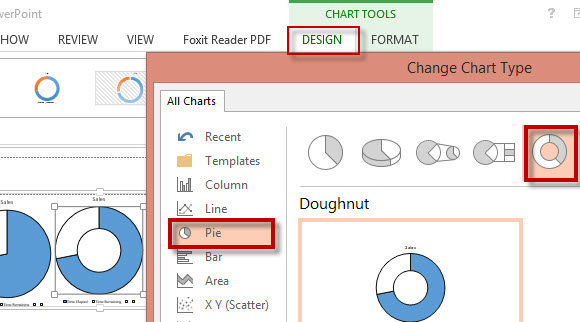
Go to File-> New-> Blank Presentation. Now Navigate to the Insert Tab on the Ribbon. Click the Chart button. From the Insert Chart menu, click Pie and click OK.
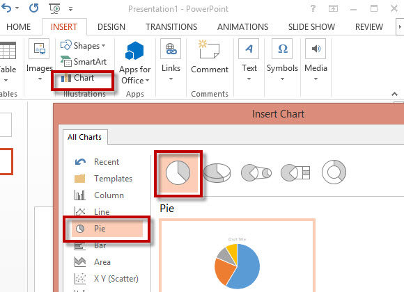
Chart Data
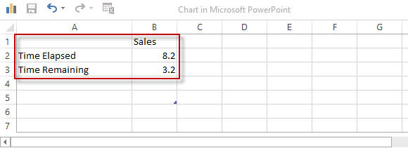
An Excel sheet appears. Use it to edit the chart data. Keep the sections of the Pie Chart to 2. One large and the other small. I have named the two sections as “time elapsed” and “time remaining”. Vary the data, and the proportion of the sections changes accordingly.
Change the Colors
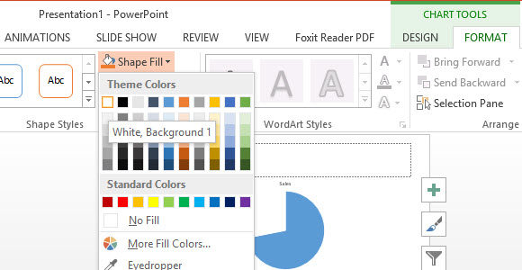
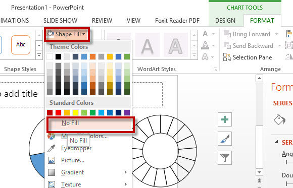
Select the smaller portion of the Pie-Chart. The Chart Tools appear. Go to the FORMAT tab. Click ‘Shape Fill” and select White or No Fill. The smaller portion represents the two hands of the clock.
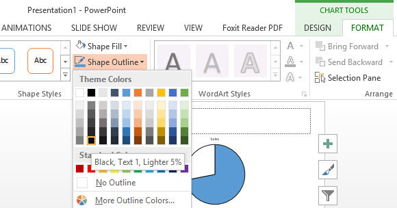
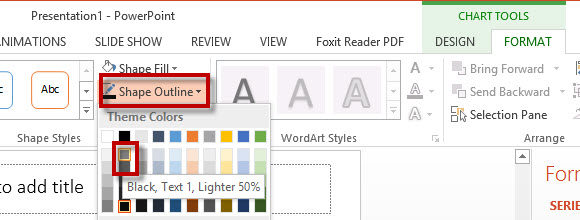
Now select the larger portion of the Pie-Chart. From the FORMAT tab click Shape Outline. Choose from a dark outline color, as this is going to serve as the outline for our clock visual. We have a simple clock visual. To add another dimension to it, follow the steps below.
Doughnut Chart
Select the already made clock visual. Copy and Paste it to form an identical one of the same size. Now click the DESIGN tab. Click CHANGE CHART TYPE. Now click Pie, and choose the Doughnut.
Add Segments
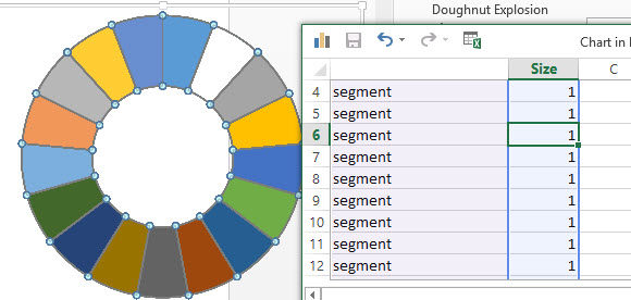
Right-Click the new Doughnut chart and click on Edit Data. Increase the number of rows or segments to add detail to the clock visual. These segments serve as hours of the clock. Enter the same size for all the segments.
Change the Colors
Select the newly created chart and remove its color by clicking the No Fill option.
Lighten the outline of the doughnut chart to add detail to the clock visual.
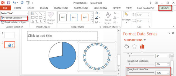
Make the Doughnut Chart look like the dials of a clock by adjusting the Doughnut Hole Size to 90%.
Align the Charts
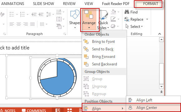
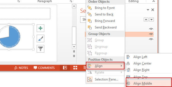
Select the two charts by holding the Ctrl key and clicking the charts one by one. From the FORMAT tab, click on Arrange. A drop-down menu appears. Click Align Center.
Now click Align Middle.
The two charts are now aligned and represent the clock visual. Change its appearance or add text to accompany it. The clock represents time and it is useful for Time Management or Diagram related PPT themes. Learn more about PowerPoint with these free PPT Tutorials.
Leave a Reply