
Lets face it, people don’t want to examine a graph that is hard to read. Labeling graphs correctly helps the audience follow along. People normally read graphs by looking at the axis of the graph. These are the vertical and horizontal lines with numbers on them. You may decide to omit the axis altogether and instead use a data label on top of each column of the graph. Here we will talk about whether you should use axis or data labels in your presentations.
What Do You Want To Communicate?
The first thing that you have to decide is the message that needs to be communicated through the graph. The way you label the graph should facilitate the audience in understanding your perspective. Are you trying to show a trend? or are you trying to draw a comparison?
Columns are great for comparing different values, and line graphs are great for showing trends. Next you need to decide if all the values in the graph are equally important or are some values more important than others?
How To Make Data Labels for Graphs?
You can easily make data labels by writing them in text boxes. You can then position the text box whereever you want. You can also make labels using the built-in option in PowerPoint. Click here to learn how to make automatic data labels in PowerPoint.
Examples of a Column Graph
Highlight a certain column by applying bold effect to its label.
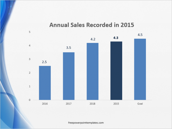
Here we’re using the axis as well as the data labels on top of each column with one label in bold. Lines have been omitted from the column graph but you may consider including them if the values on the column graph are too large.
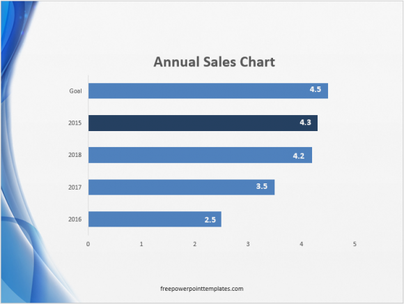
You can also to use labels inside columns like this. But these are custom labels that you can make yourself using simple drawing tools in PowerPoint.
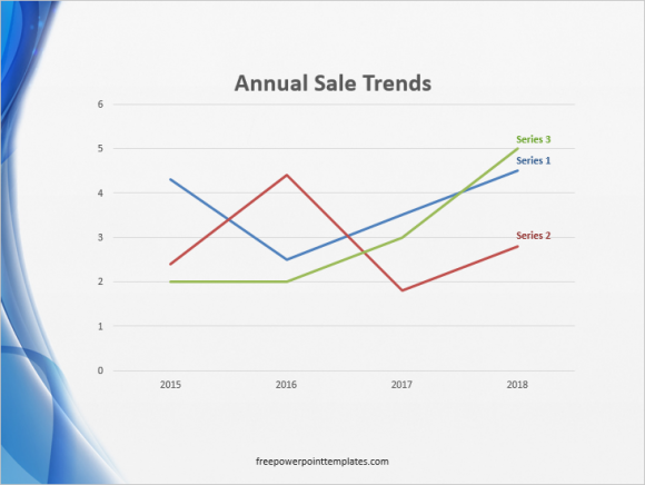
Example of a Line Graph
No one likes looking for the legend to find out what each line means. Its usually hidden somewhere around the line graph. Not very helpful and kinda annoying. Luckily you can change that by using a label for each line. Click here to learn how to make a line graph like this one below.
(Click here to download the template used in these examples)
Leave a Reply