We use charts and graphs instead of showing a table or a list to the audience. Because figuring out lists and tables is boring and looking at visuals like charts and graphs is a lot easier. As a presenter, it is not only important that you use a graph but that you use it correctly. Because choosing the wrong type of visual can actually make things confusing and more difficult to understand.
Here, we will learn when to use a bar or column chart as well as how to make a simple bar or column chart in PowerPoint 2013 (should be similar on other versions of PowerPoint). Lets go!
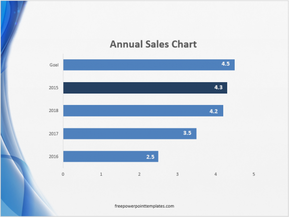
Example of a Column chart
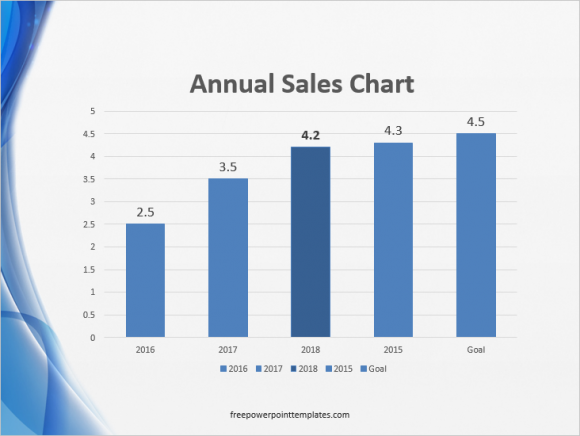
Example of a Bar chart
What Are Bar and Column Charts?
Bar charts and Column charts display data using rectangular bars. If they are vertical bars then it is a bar chart. If they are lying horizontally then it is a column chart.
When To Use Bar and Column Charts?
Bar charts and Column charts are both used to present data visually. These charts have two axis to display data from a table with two columns. Bar charts and Column charts are used because they make it easier to see visually the difference between large and small values.
They are similar but not the same, and thus have slightly different ideal use cases.
Bar Chart vs. Column Chart: Long Data Labels
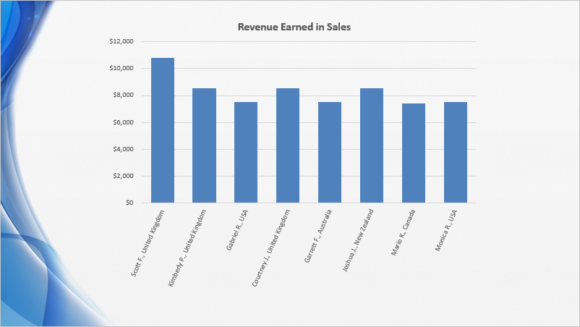
Column charts are not ideal when using really long data labels although rotating the labels can make them look better as shown below:
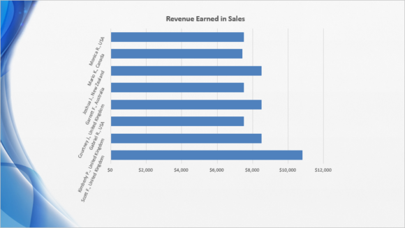
Bar charts may look better when you rotate the names so that they take less space. For example, if you have a cluttered bar graph as shown below..
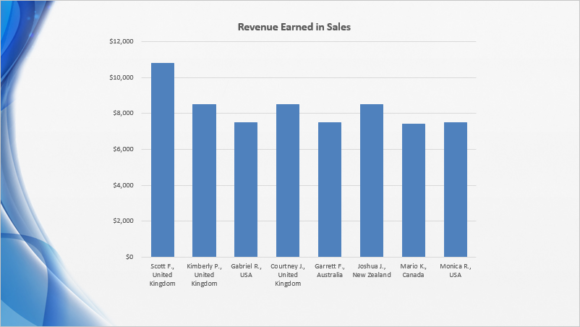
Then you can rotate its labels to look like this:
How To Rotate The Labels on a Bar or Column Chart?
You can do this by clicking the labels area to select it. And Double-clicking to see additional options on the right hand side. After that, click Text Options and click the third tab as shown below.
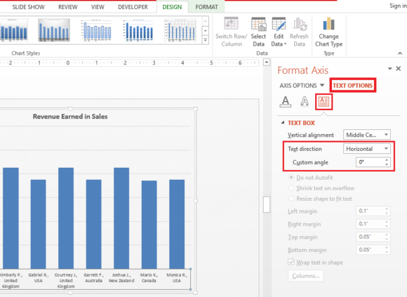
Change the angle to -66 Degrees to give them a slanted look.
Bar Chart vs. Column Chart: Negative Values
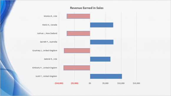
Negative values are generally perceived as low and Positive values are perceived as being high. So, when making a chart to show positive and negative values, it is better to choose a bar chart like this:
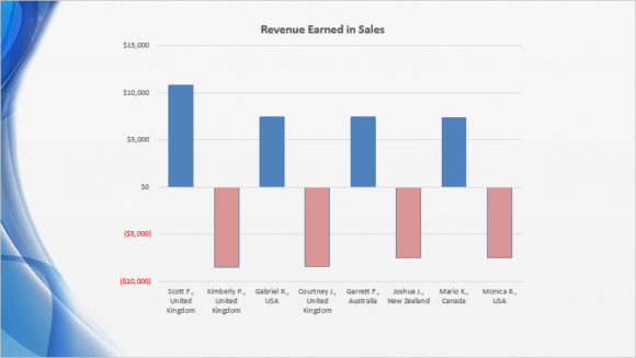
Instead of using a column chart like this:
(Download the Template used in these examples by clicking here)
Column Chart Resources
How to Make a Simple Column Graph in PowerPoint 2013
3 Ways to make a Column Chart even better
Learn How To Highlight Columns in a Graph in PowerPoint 2013
How to Change Colors of Columns in a Column Graph in PowerPoint 2013
How To Label Line and Column Graphs

Leave a Reply