
Professionals from many different fields make PowerPoint presentations. Some provide financial services. Others provide services in a technology related field. Some deal with numbers while others deal with technical terms.
What Does A Typical Presentation Look Like?
Some slides contain plenty of data in tables. Some contain graphs, charts, and bullet points. These presentations are usually fine, but they don’t really look that great. The problem?
Most Presentations Don’t Contain Compelling Visuals
What we need is visuals that convey meaning without looking too boring. Of course, using the right ones should give us the desired effect. However, most people are not able to choose the right visuals for their specific message.
Do I Need To Take a Graphics Course?
No, you don’t necessarily need to take a course in graphics design to make good PowerPoint presentations. All you need is the ability to pick the right visuals. And, this is something anyone can learn!
All you need to do is to ask the right questions and a place to find those visuals, Thats all!
What Questions Do I need To Ask?
First of all ask yourself, is my message clear and simple? The bigger your audience, the simpler your message needs to be. Only keep one main topic per PowerPoint slide.
After that ask, what type of message is it? Is it a relation, a comparison, or an example?
Choosing The Correct Visual
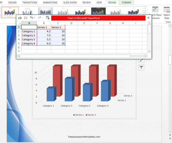
When showing Values compared to each other, use a bar or column graph. You can also use a “comparison chart“.
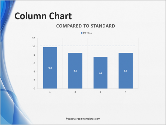
When showing values compared to an Ideal, use a horizontal or vertical bar or column graph with a dotted line showing the ideal number.
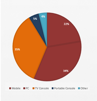
When comparing values to a total whole, try using a pie chart or a treemap chart.
Both Line and Bar graphs can be used to show trends. If you’re confused about which one to use, then please refer to this this article.

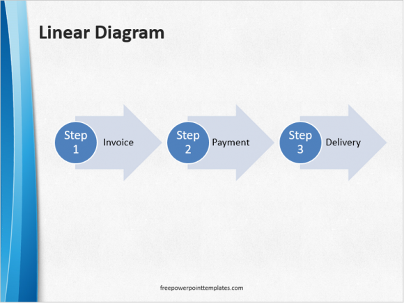
You can show a sequence of steps in a process by using a few visuals explained here.
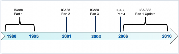
Relation between steps over time can be shown using a timeline.
If your’re talking about a noun (e.g. a person, place, or thing) then you should try using its picture as the background of your slide.
Leave a Reply