The Meaning of Your Data is Paramount
Data is most accurately expressed in its entirety as a table. But, to communicate the meaning of the data to people, …

Probably the most common way that people like to make their presentations is by copying slides from old presentations to …

Presentation audiences complain about text more often than anything else. There’s nothing fun about a presentation where the presenter loads slide …
Making presentations is often prone to delays and rushing. People often forget to design their presentations properly. This usually involves skipping some very …

Setting a goal for your presentation is an important first step in making any presentation. While you may think that you have …

A non-linear presentation is different from a linear presentation. A linear presentation has all slides and topics in a predetermined …

Visuals! We love them in our presentations and why shouldn’t we? They add to the charm of the presentation and help …
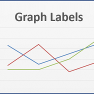
Lets face it, people don’t want to examine a graph that is hard to read. Labeling graphs correctly helps the audience follow …
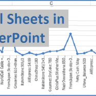
Some employees are told by their employers to show a whole spreadsheet while giving a presentation. Even though its a bad idea …

Quad charts are simple charts divided into four quadrants or portions. The chart is actually pretty simple at its core. Here an …