Charts in PowerPoint: Donut Charts
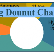
The use of Donut charts seems to be a rising trend. Simple donut charts look a lot like pie charts. …

The use of Donut charts seems to be a rising trend. Simple donut charts look a lot like pie charts. …
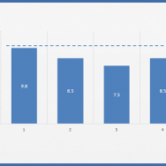
Many people use data from Excel sheets while following the same old methods. Usually this results in presentations that are fine. …

So many presenters use spreadsheets, numbers, and tables in their presentations. When asked, the presenters respond by saying that the …
Text in PowerPoint presentations is all about brevity. Depending on your audience, they might want to see more graphics instead of text. …

It is very common for many people to use data from excel sheets in PowerPoint presentations. There are also a few …
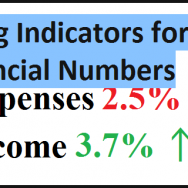
It is important that people understand numbers from financial reports in PowerPoint presentations. All too often we see that numbers …

Even though many PowerPoint pros are calling for less text in presentation slides, there is no doubt that text is …

One thing that bothers people at presentations the most is information overload. Including too many numbers, graphs, charts, and topics …

Not being able to find a suitable diagram for certain types of data is a common problem. What are the best …

Many people want to use video in their PowerPoint presentations but they can’t. They’re worried about video production costs and editing …